Loues Branding Project
Visualizing Blockchain Confidence
Loues is a next-gen blockchain platform designed to make finance faster, more secure, and more intuitive. It empowers users to manage their assets without intermediaries, with clarity and control.
I was responsible for developing its full visual identity — from interpreting the brief to designing the logo, color palette, typography, and interface mockups. The goal was to create a system that feels modern and trustworthy, while clearly communicating the platform’s core values across every touchpoint.
ESSENTIAL VALUES
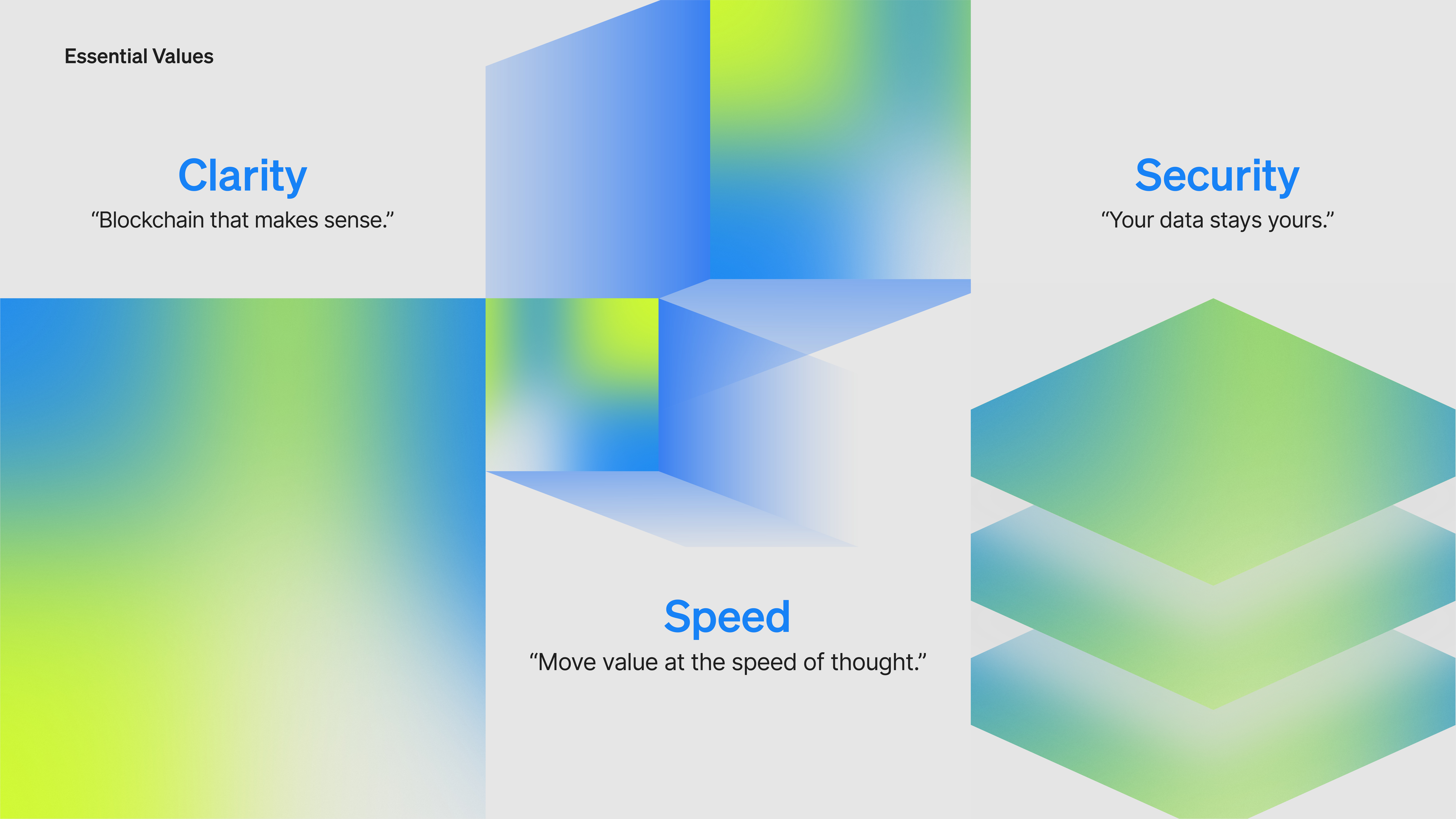
Guided by the brief, I distilled Loues into three core values: clarity, speed, and security. The aim was to translate these principles into a visual system that feels modern, trustworthy, and easy to use — making blockchain technology feel clear, fast, and truly user-friendly.
Guided by the brief, I distilled Loues into three core values: clarity, speed, and security. The aim was to translate these principles into a visual system that feels modern, trustworthy, and easy to use — making blockchain technology feel clear, fast, and truly user-friendly.
LOGO
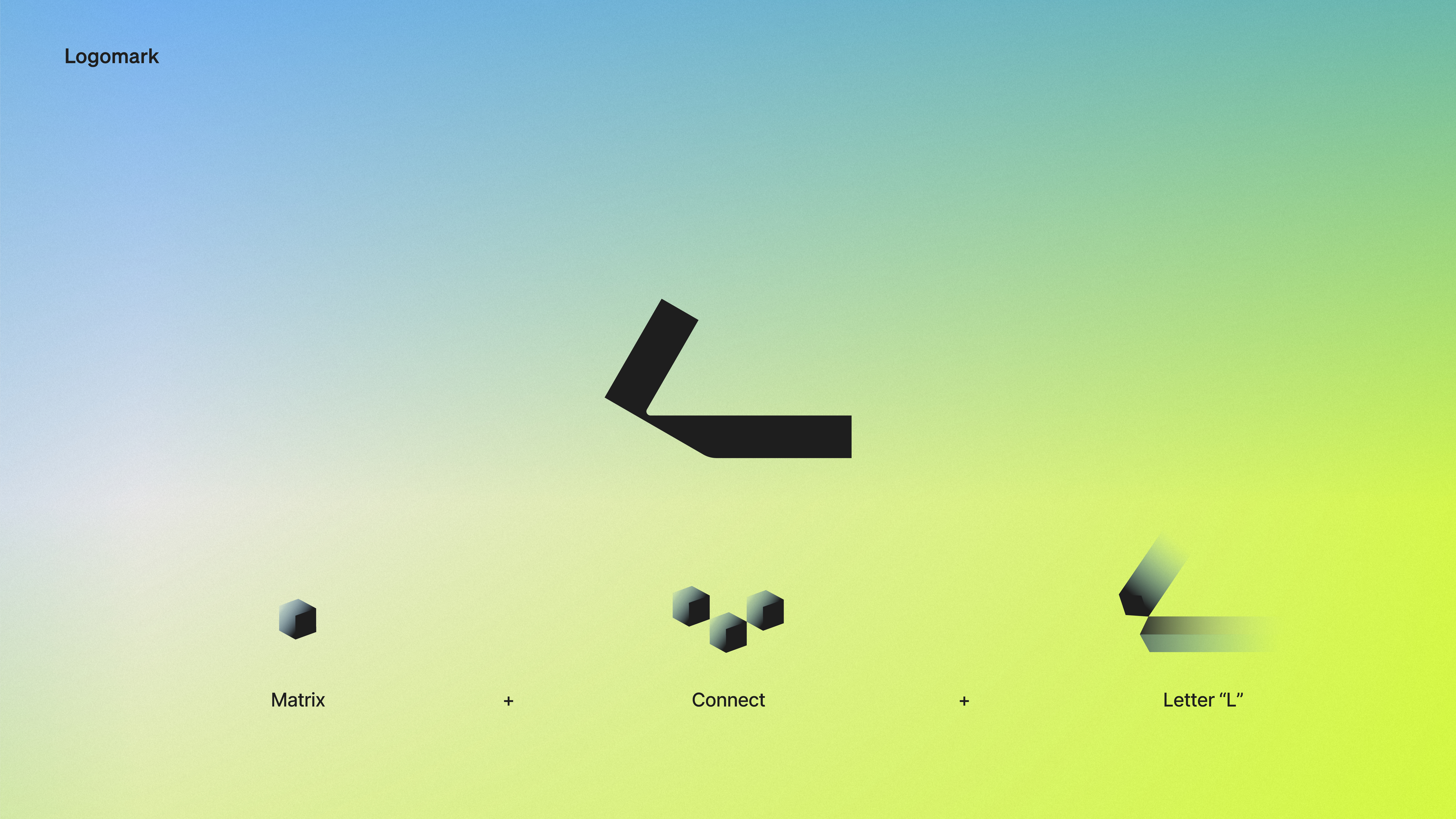
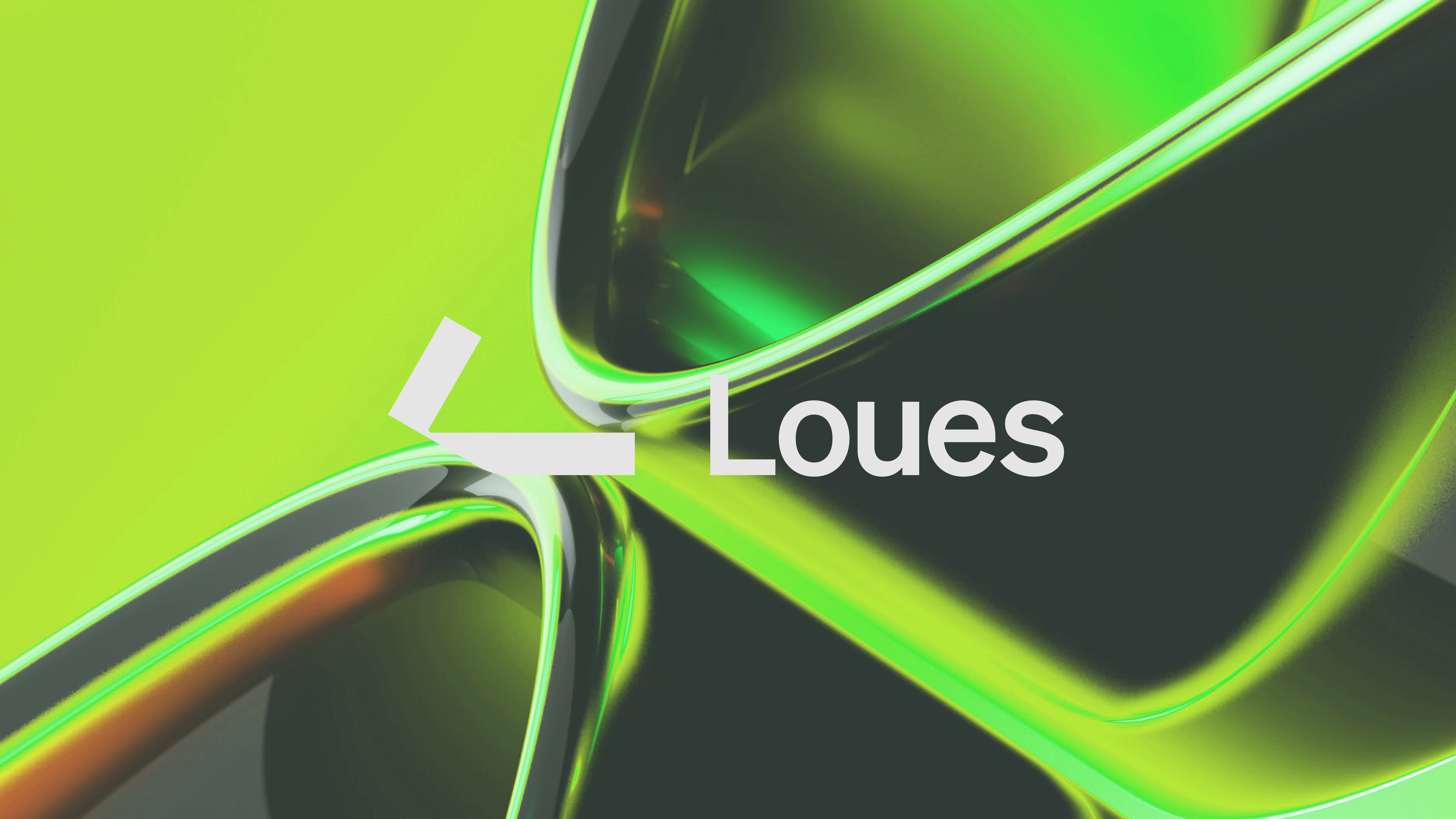
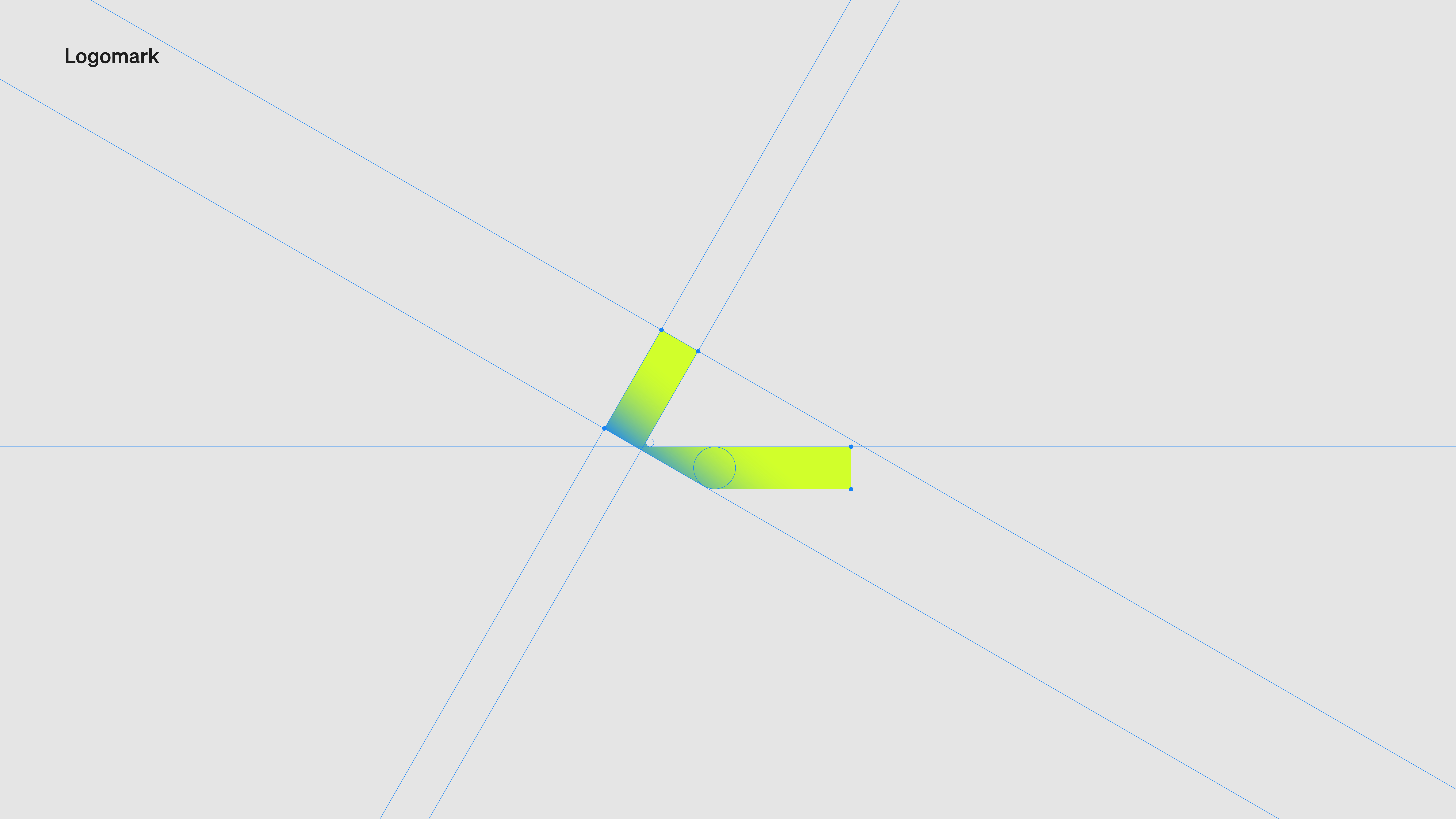
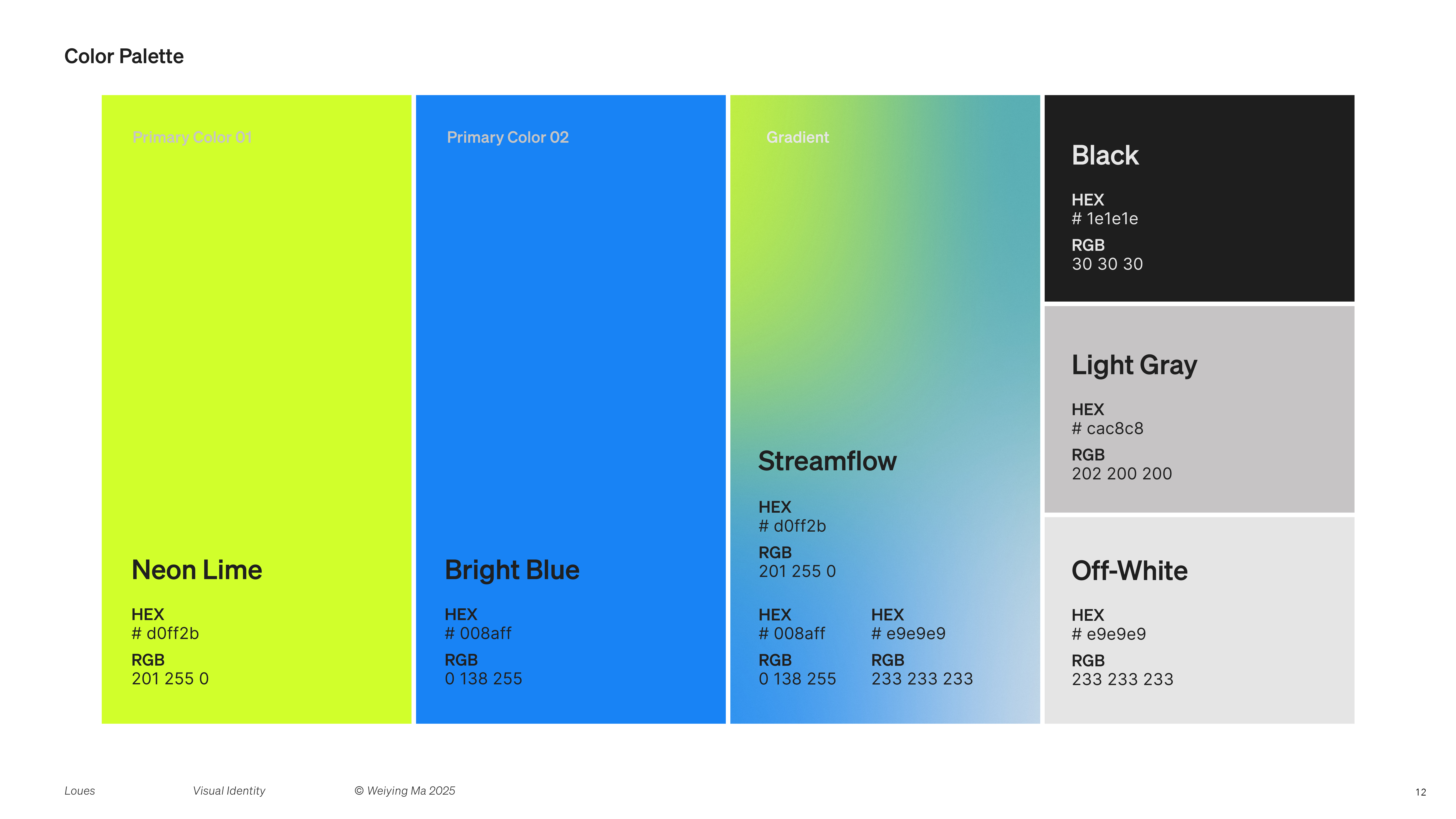
The Loues identity expresses clarity, connection, and forward momentum. The logomark begins with a single cube — structured and secure, like a blockchain block — and builds into an abstract ‘L’ through a chain of connected forms, symbolizing flow and progress. To reinforce this, I used a bright neon lime for energy and a grounded blue for trust, connected through gradients that add motion and freshness. The result is a visual system that feels modern, confident, and built for the future.
The Loues identity expresses clarity, connection, and forward momentum. The logomark begins with a single cube — structured and secure, like a blockchain block — and builds into an abstract ‘L’ through a chain of connected forms, symbolizing flow and progress. To reinforce this, I used a bright neon lime for energy and a grounded blue for trust, connected through gradients that add motion and freshness. The result is a visual system that feels modern, confident, and built for the future.
APPLICATIONS
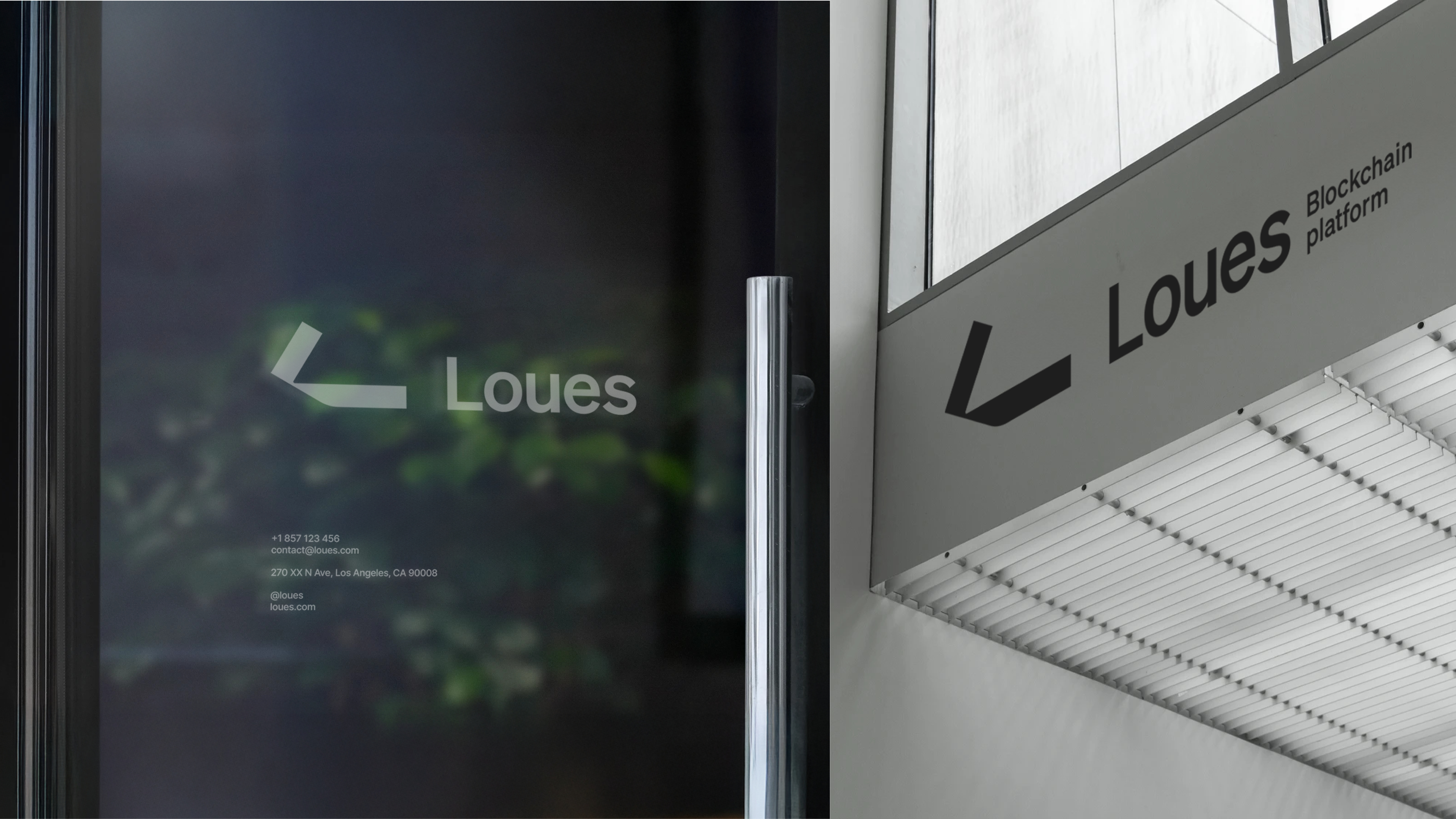
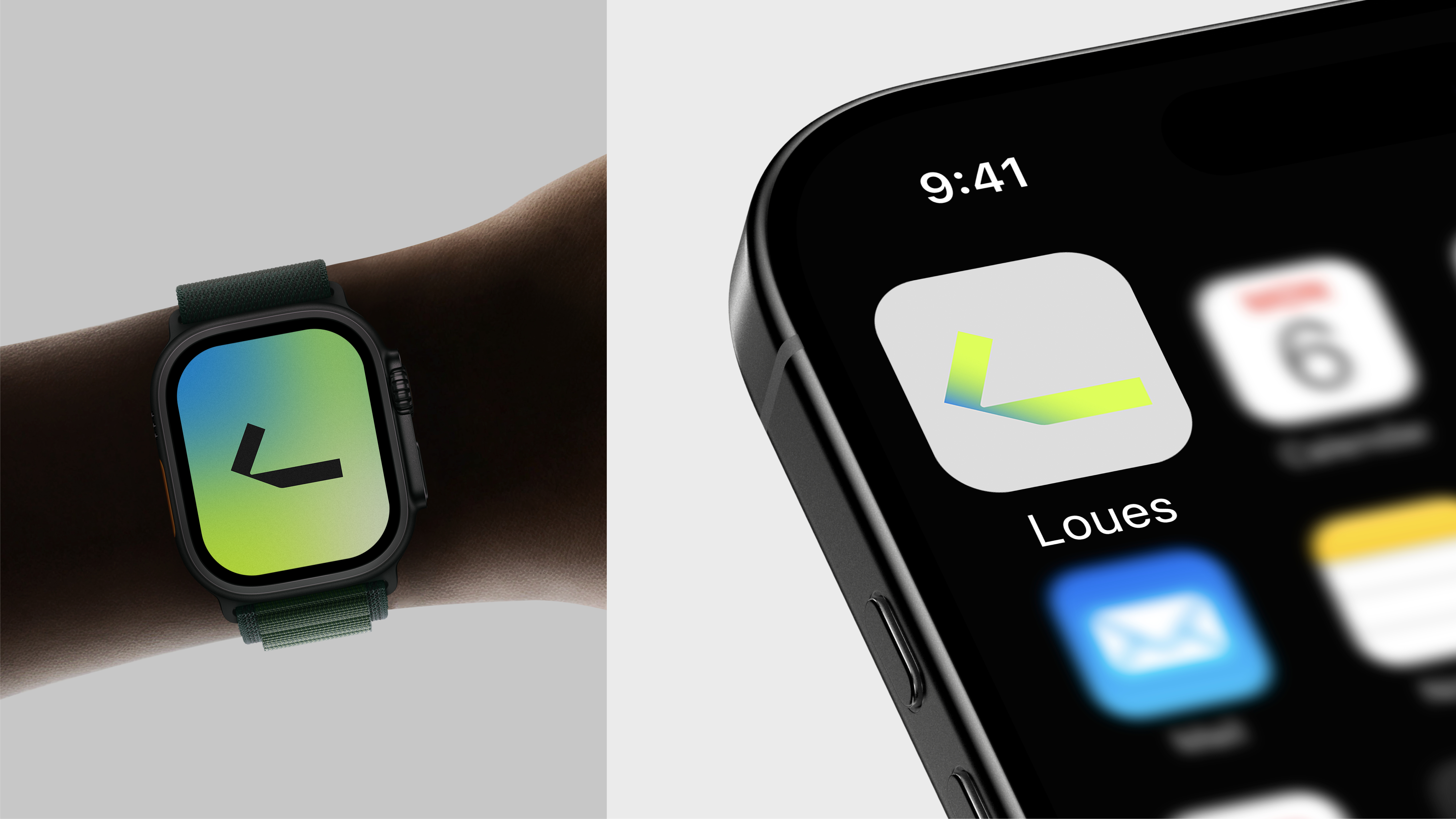
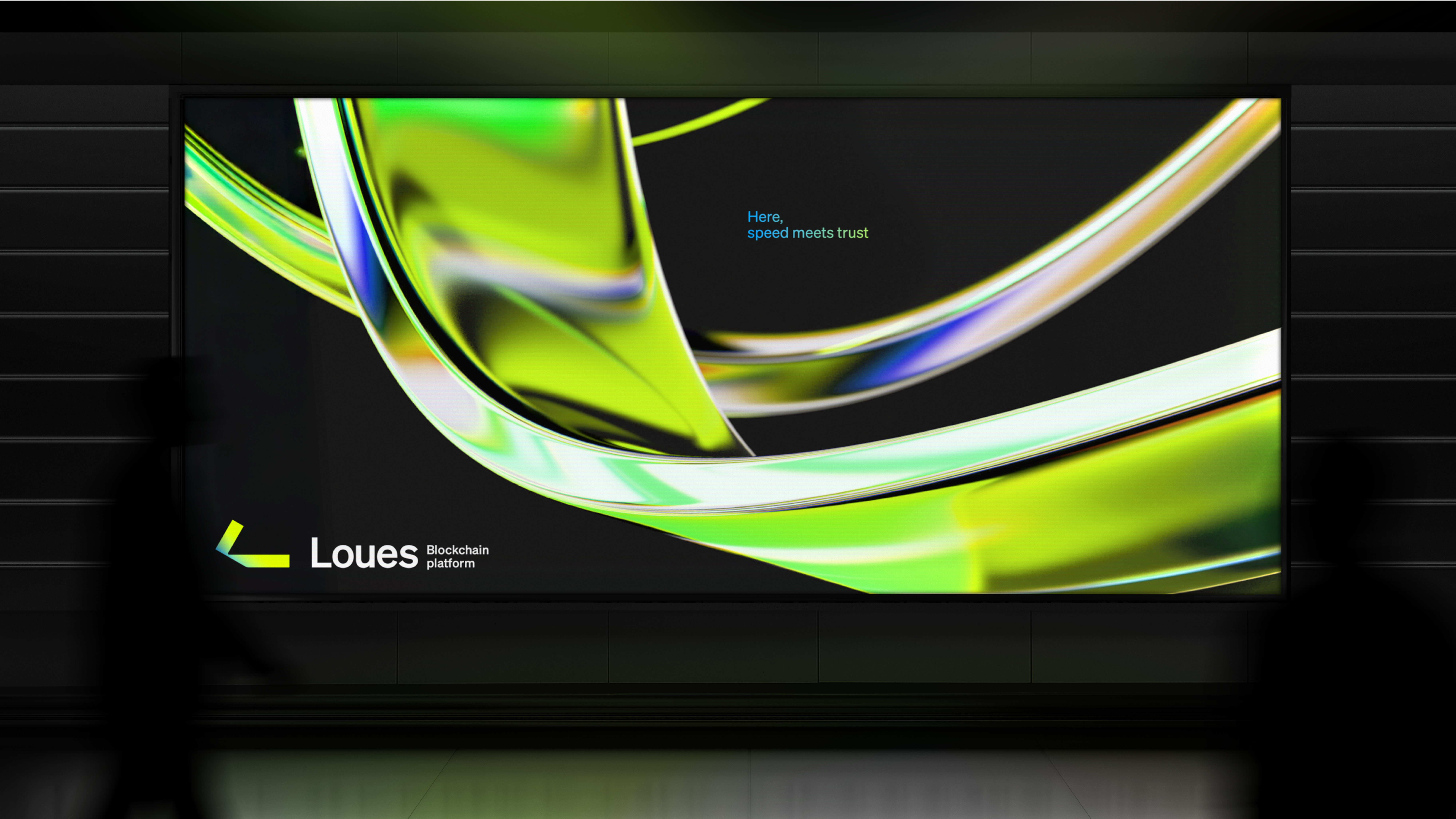
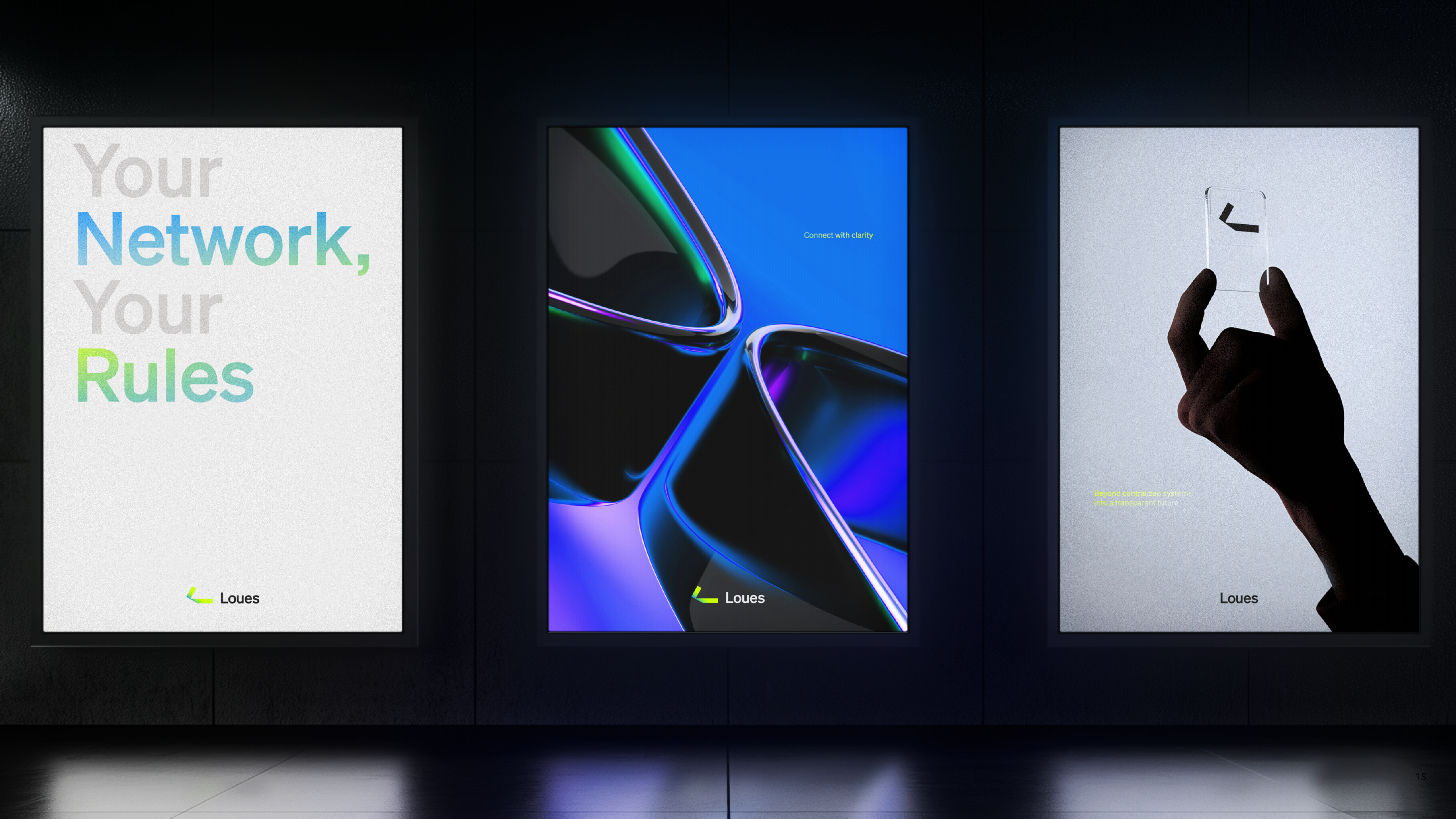
I explored how the brand shows up in the real world — from signage and wearable tech to app icons and digital screens. I wanted it to feel consistent and familiar no matter where people encounter it — not just as a logo, but as something they can use and trust day to day.
I explored how the brand shows up in the real world — from signage and wearable tech to app icons and digital screens. I wanted it to feel consistent and familiar no matter where people encounter it — not just as a logo, but as something they can use and trust day to day.
THE DIGITAL EXPERIENCE
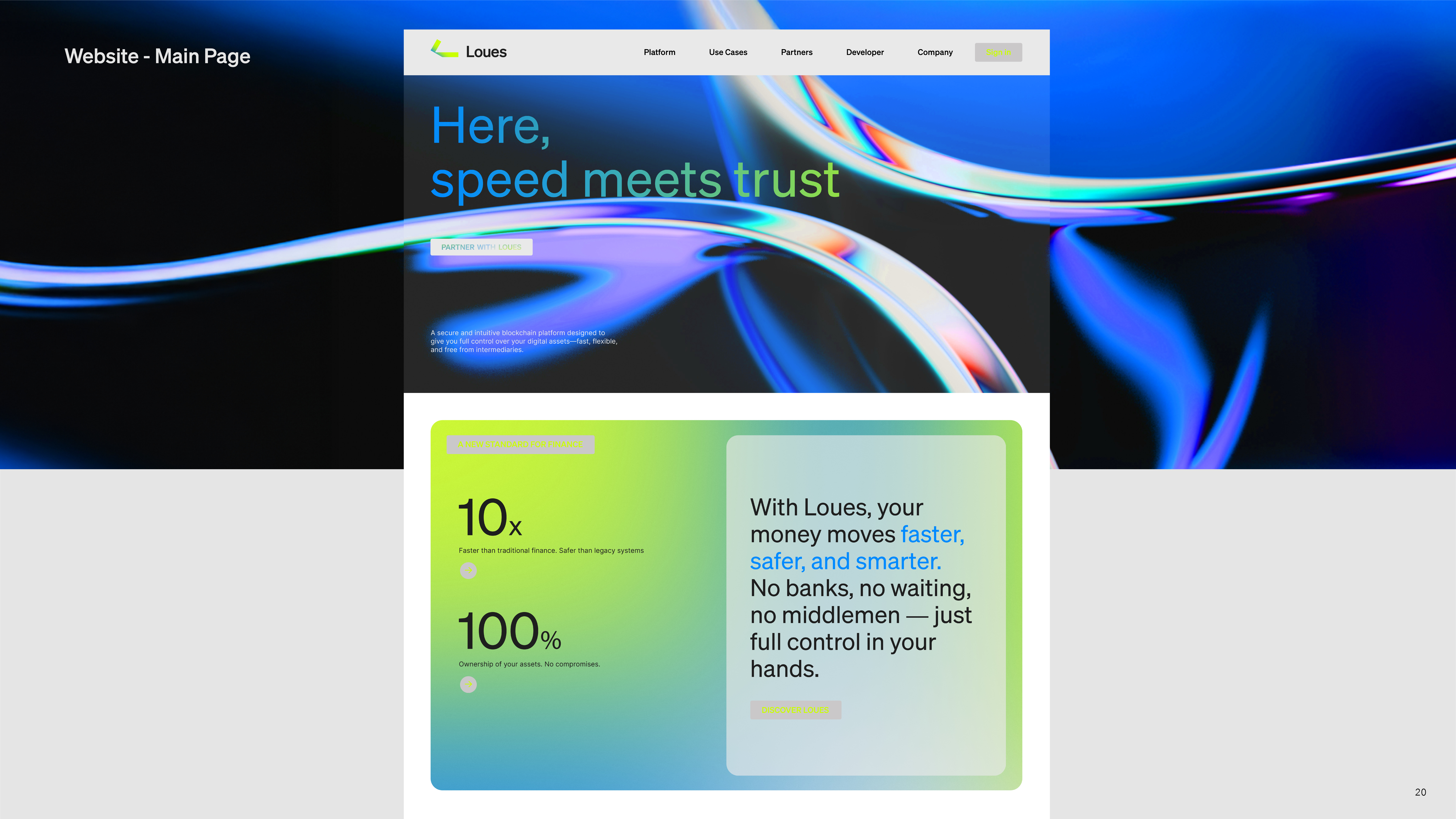
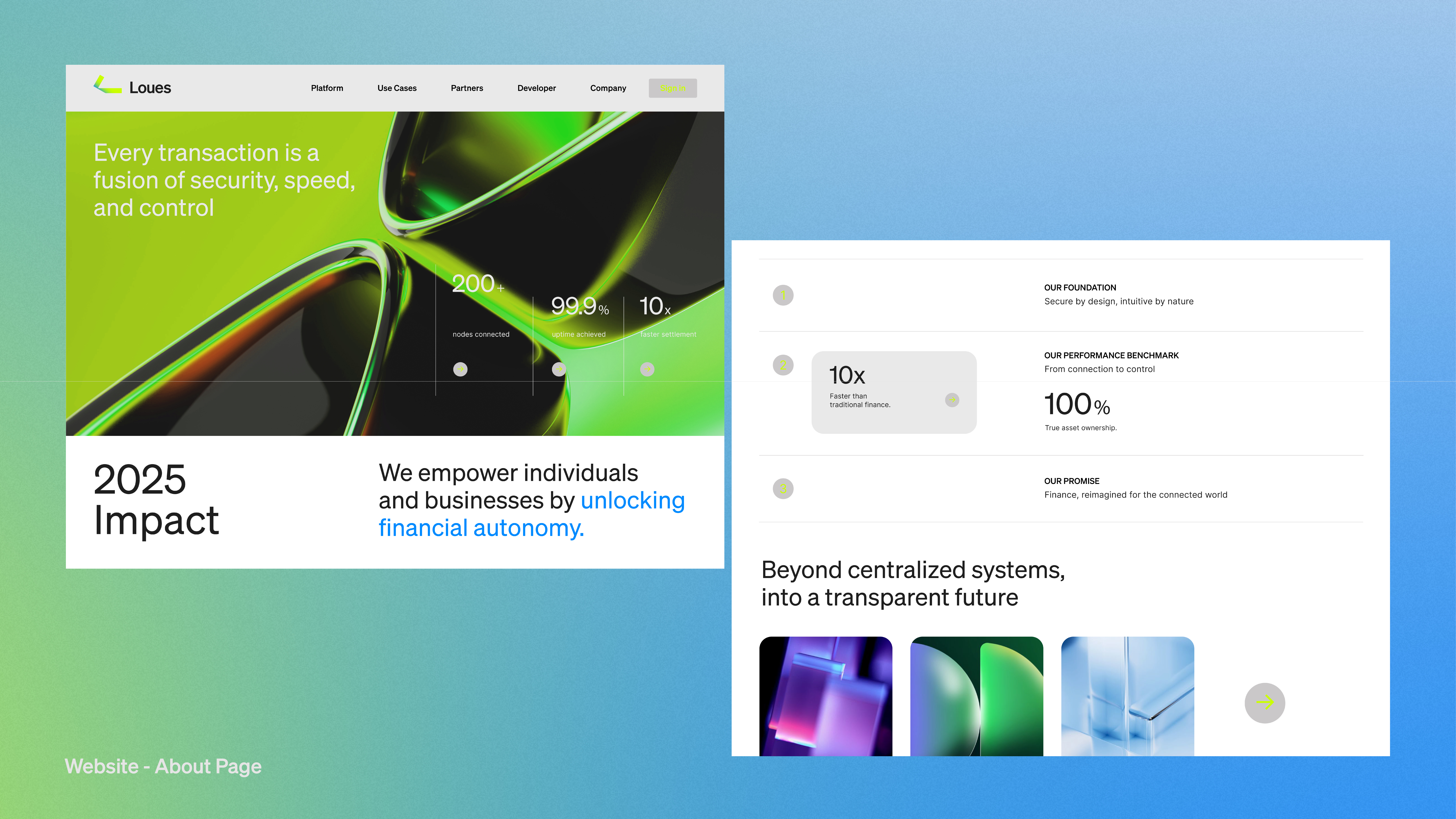
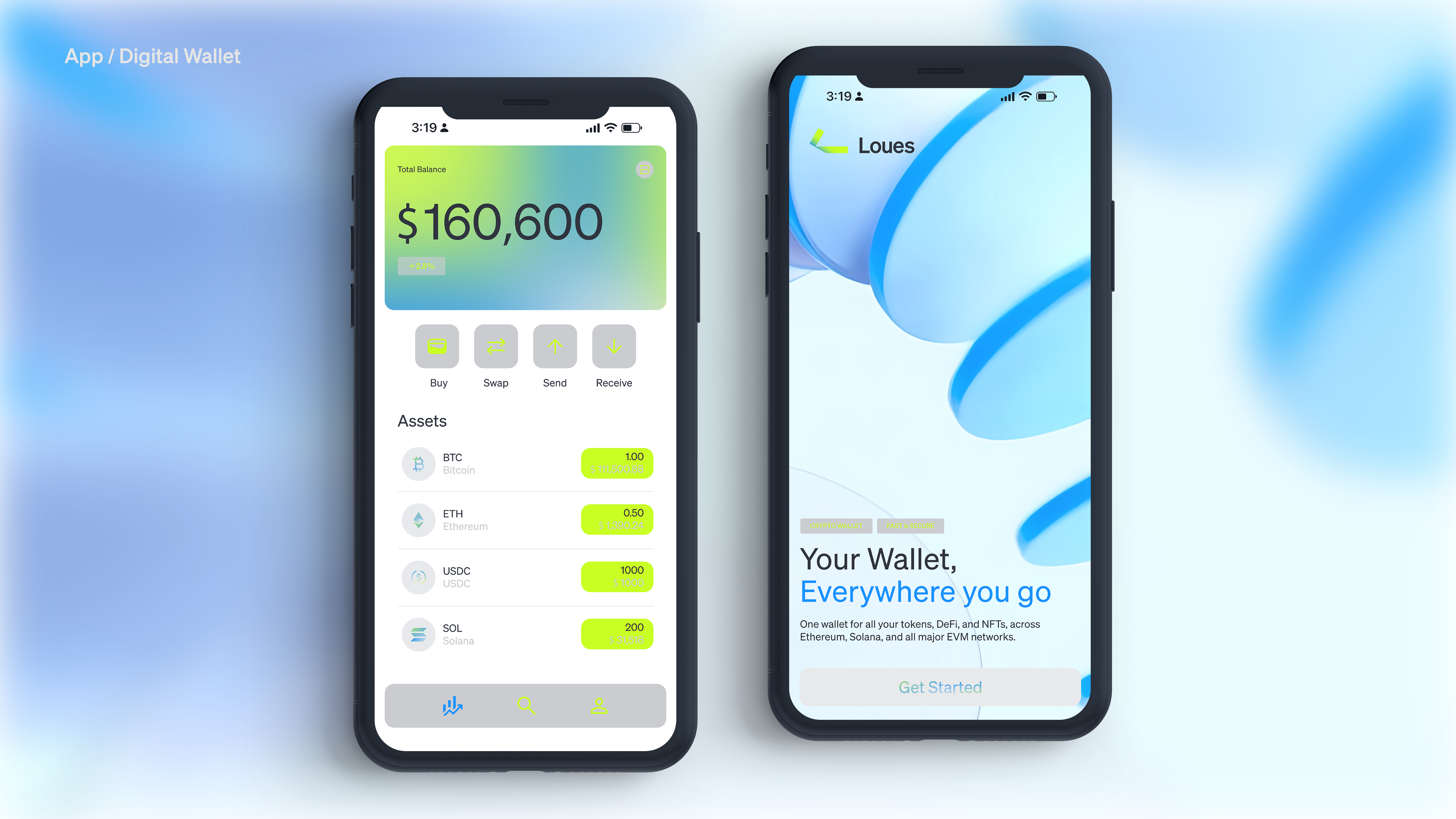
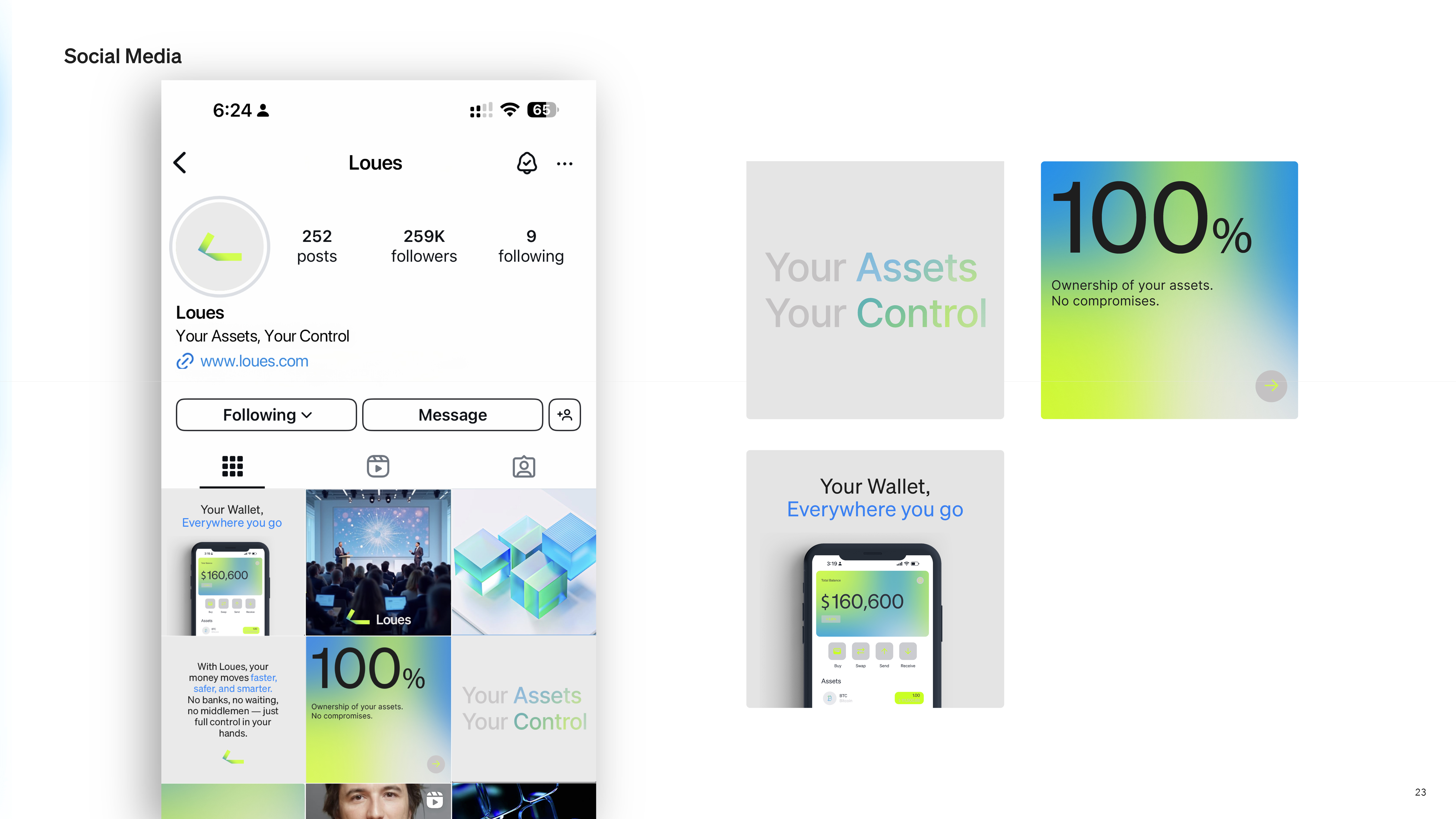
To expand the identity, I also explored how Loues could appear across digital environments — including a landing page, an About page, and the app interface where users can view balances, manage assets, and complete transactions with ease. I also showed how the brand translates visually across social media platforms, keeping the voice and look consistent.
To expand the identity, I also explored how Loues could appear across digital environments — including a landing page, an About page, and the app interface where users can view balances, manage assets, and complete transactions with ease. I also showed how the brand translates visually across social media platforms, keeping the voice and look consistent.
Credits
Client
Loues / Airfoil Studio
Loues / Airfoil Studio
Designer
Weiying Ma
Weiying Ma
Time Spent:
40 hours
Year:
2025
40 hours
Year:
2025
