ARTFORUM
MAGAZINE REBRAND
Diverse Voices
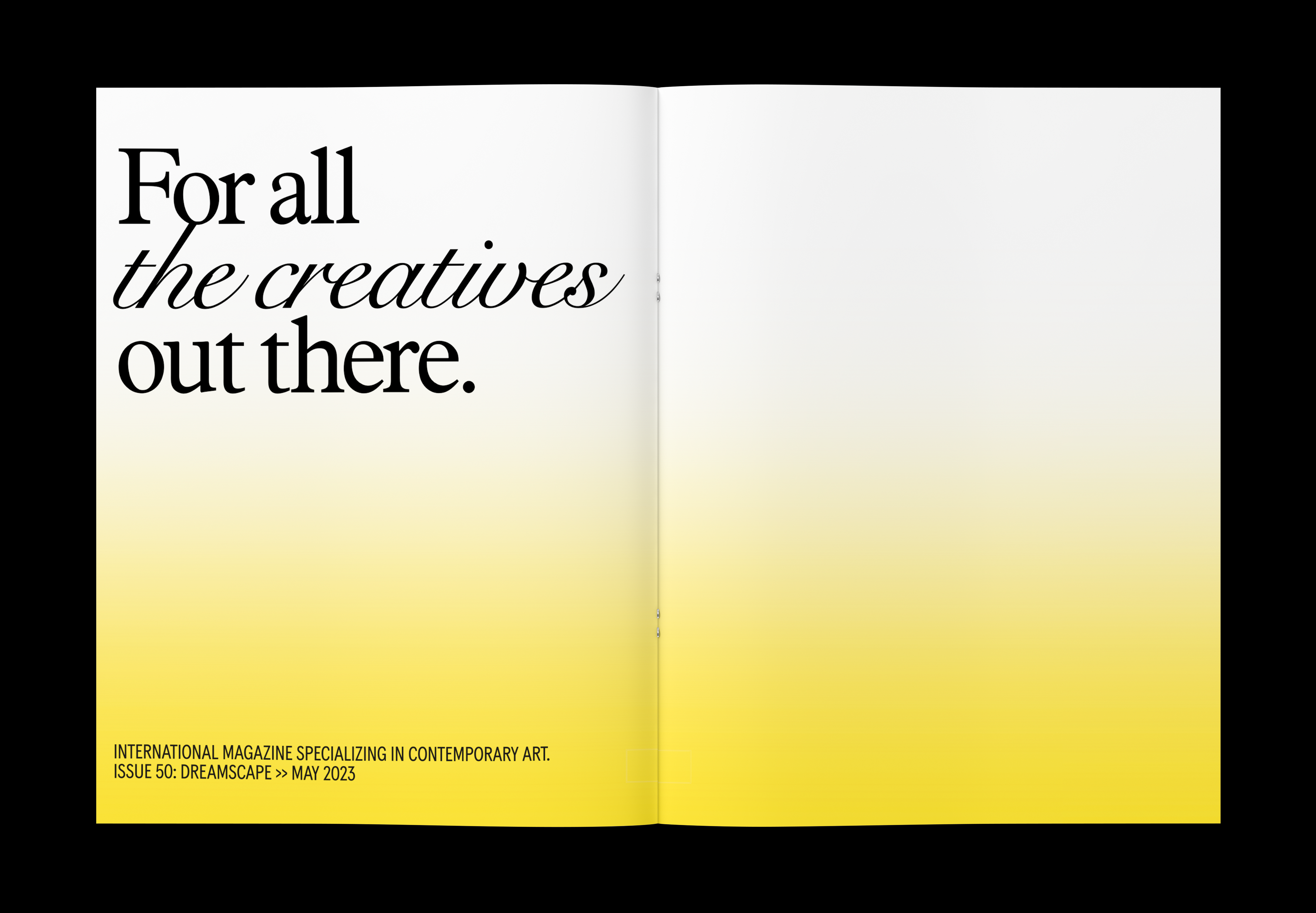
Artforum is a monthly magazine focused on contemporary art and culture. This project explores a strategic rebranding and redesign to establish Artforum as the leading platform for critical discourse in today’s art world—one that amplifies diverse voices and showcases the most relevant and thought-provoking work of our time. I redesigned the magazine’s visual identity and editorial layout to reflect this renewed mission and connect more deeply with its audience.
LOGO DESIGN & ANIMATION
The letter O within the word "forum" serves as a symbol representing a visual portal or window that opens to the ideas and contents within the magazine.
The letter O within the word "forum" serves as a symbol representing a visual portal or window that opens to the ideas and contents within the magazine.
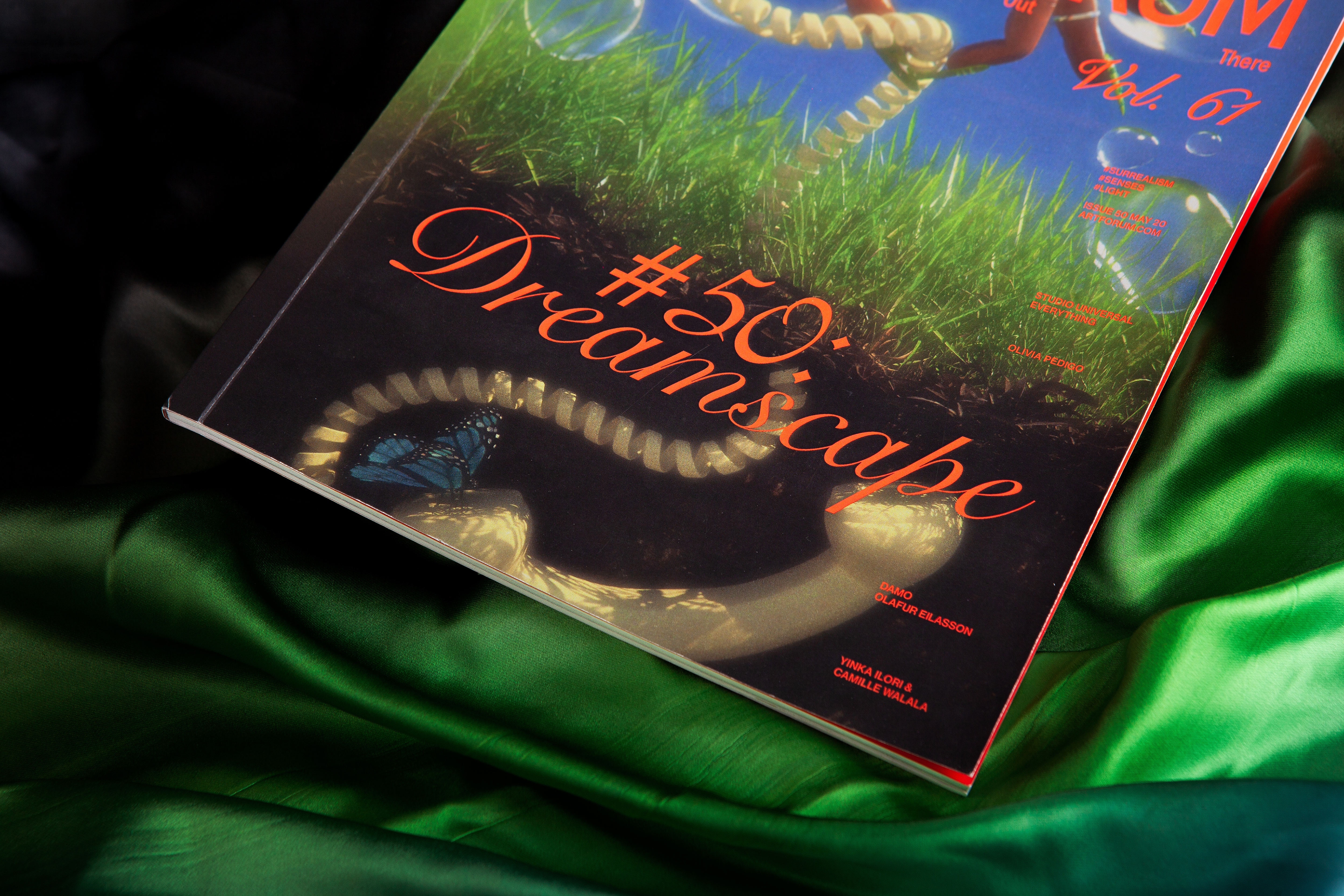
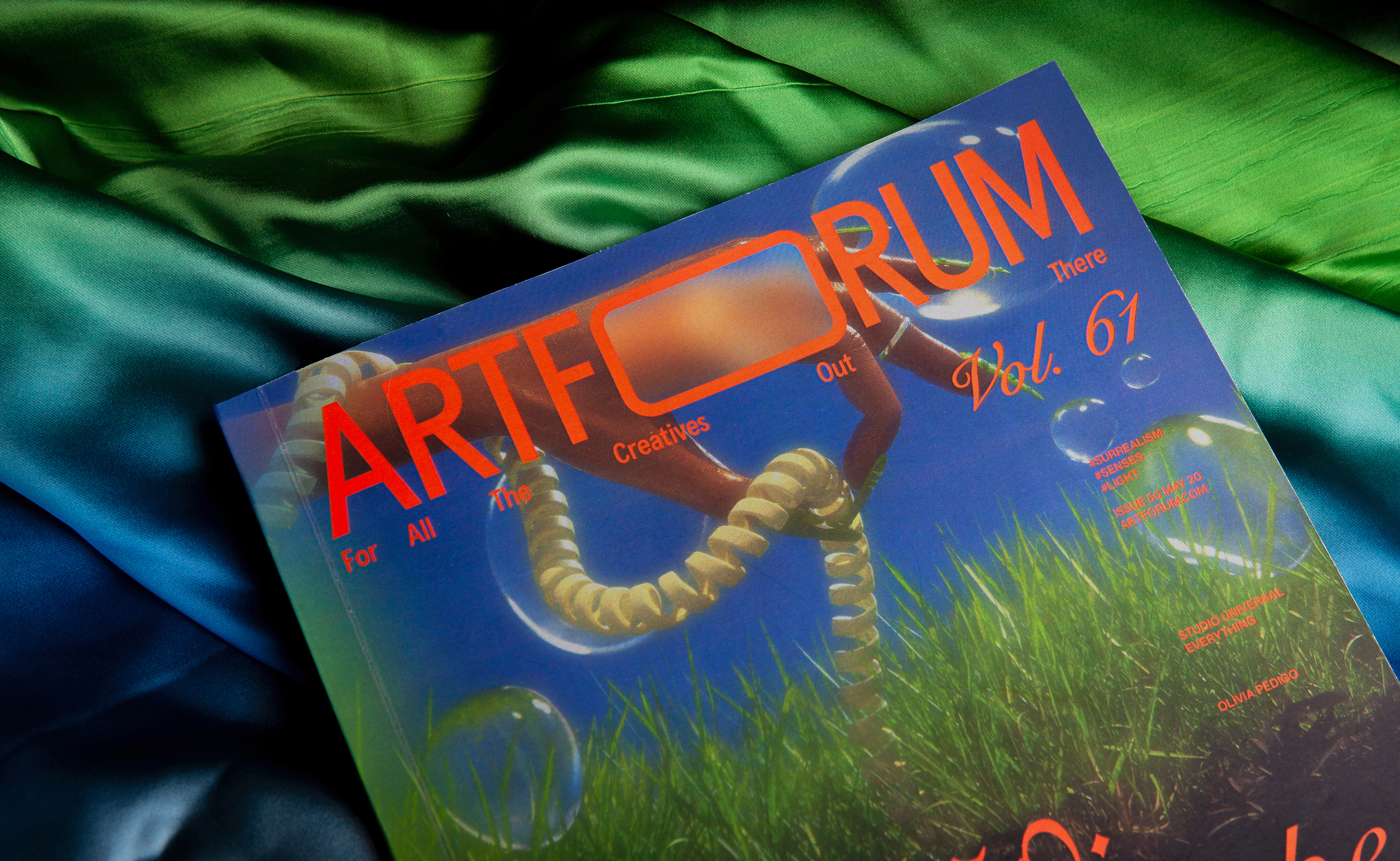
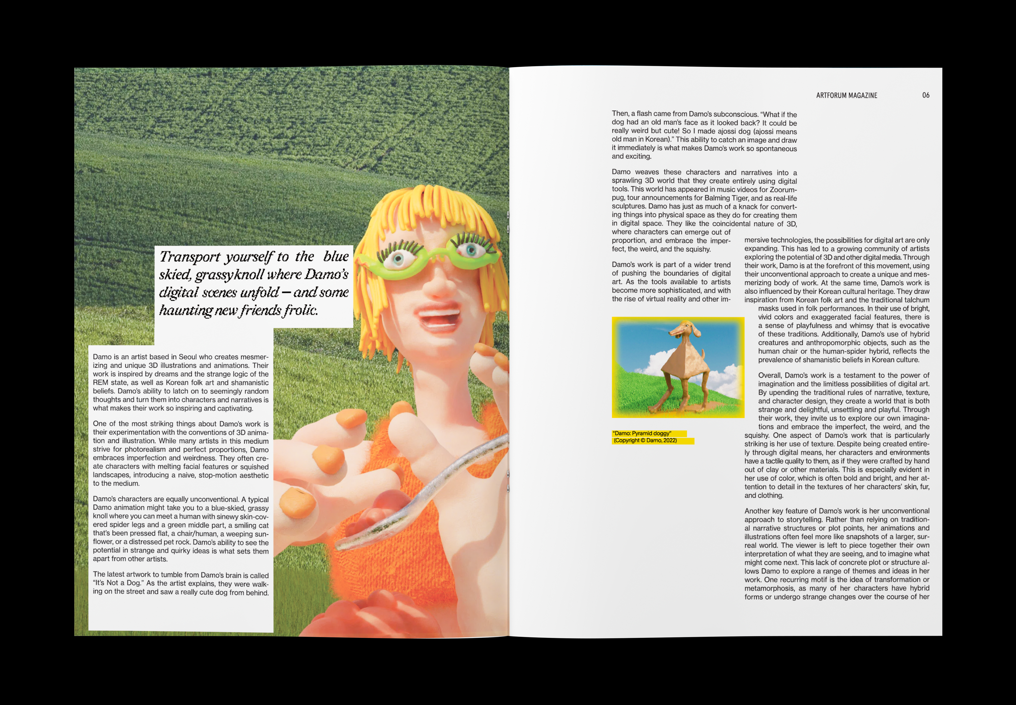
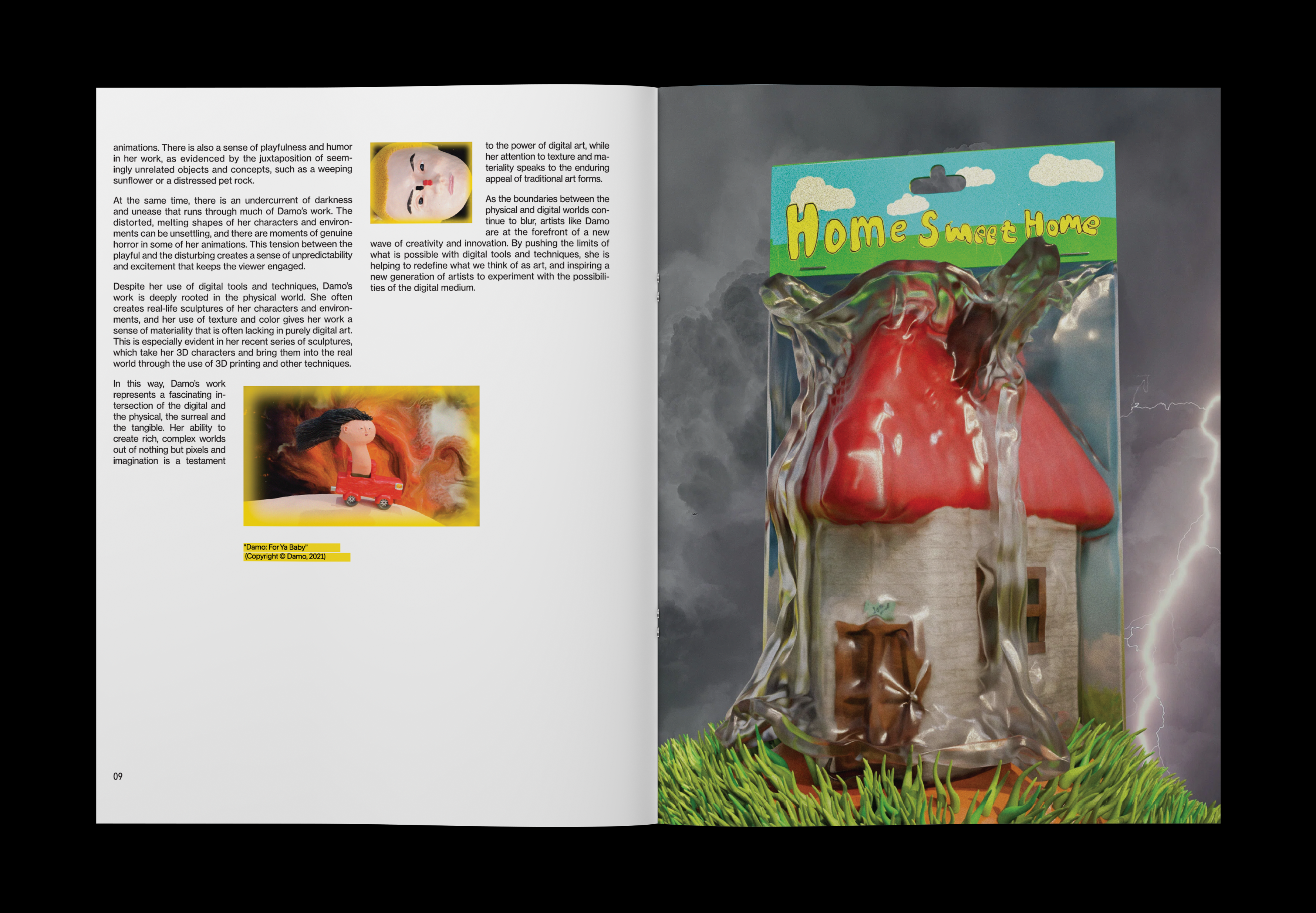
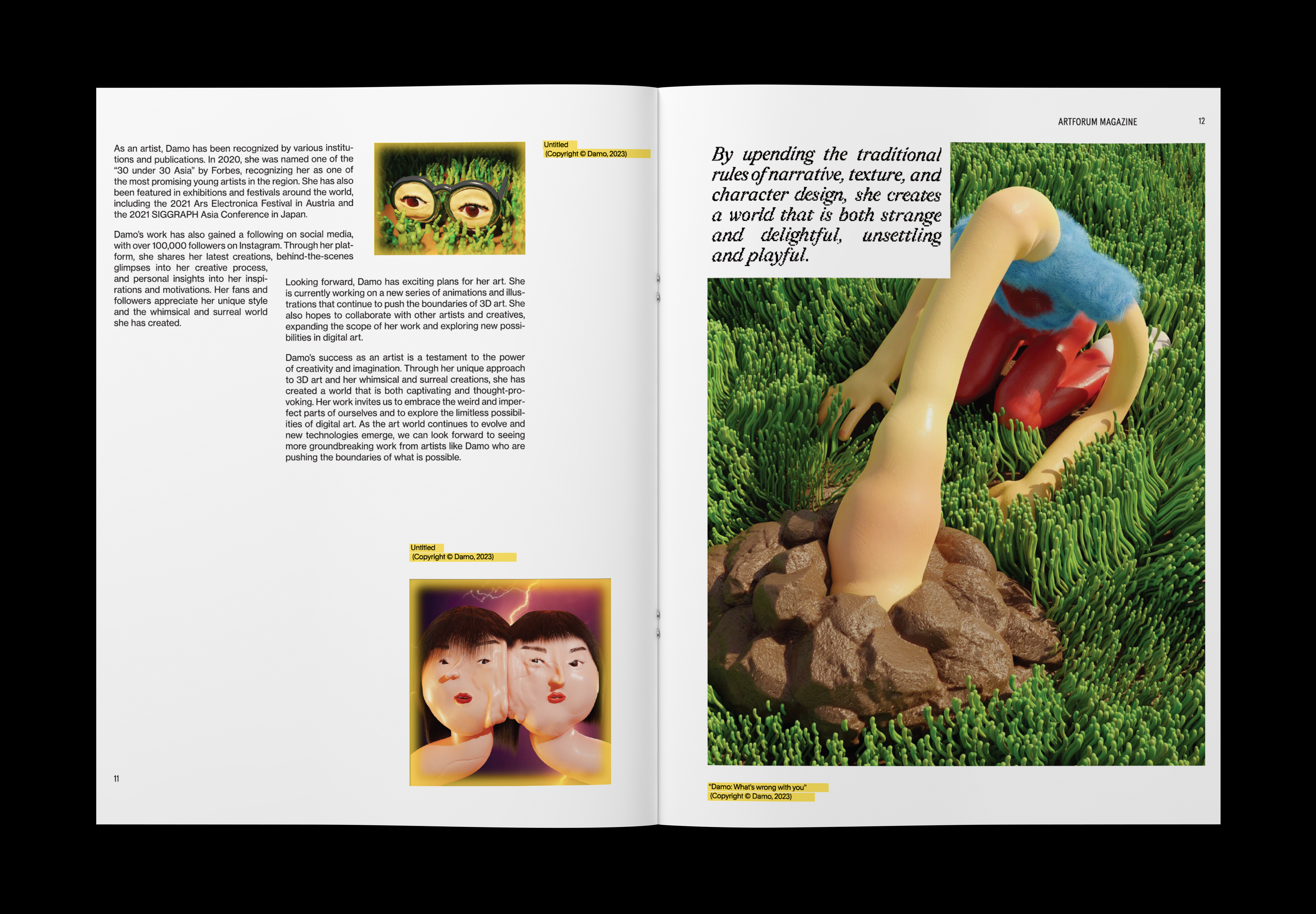
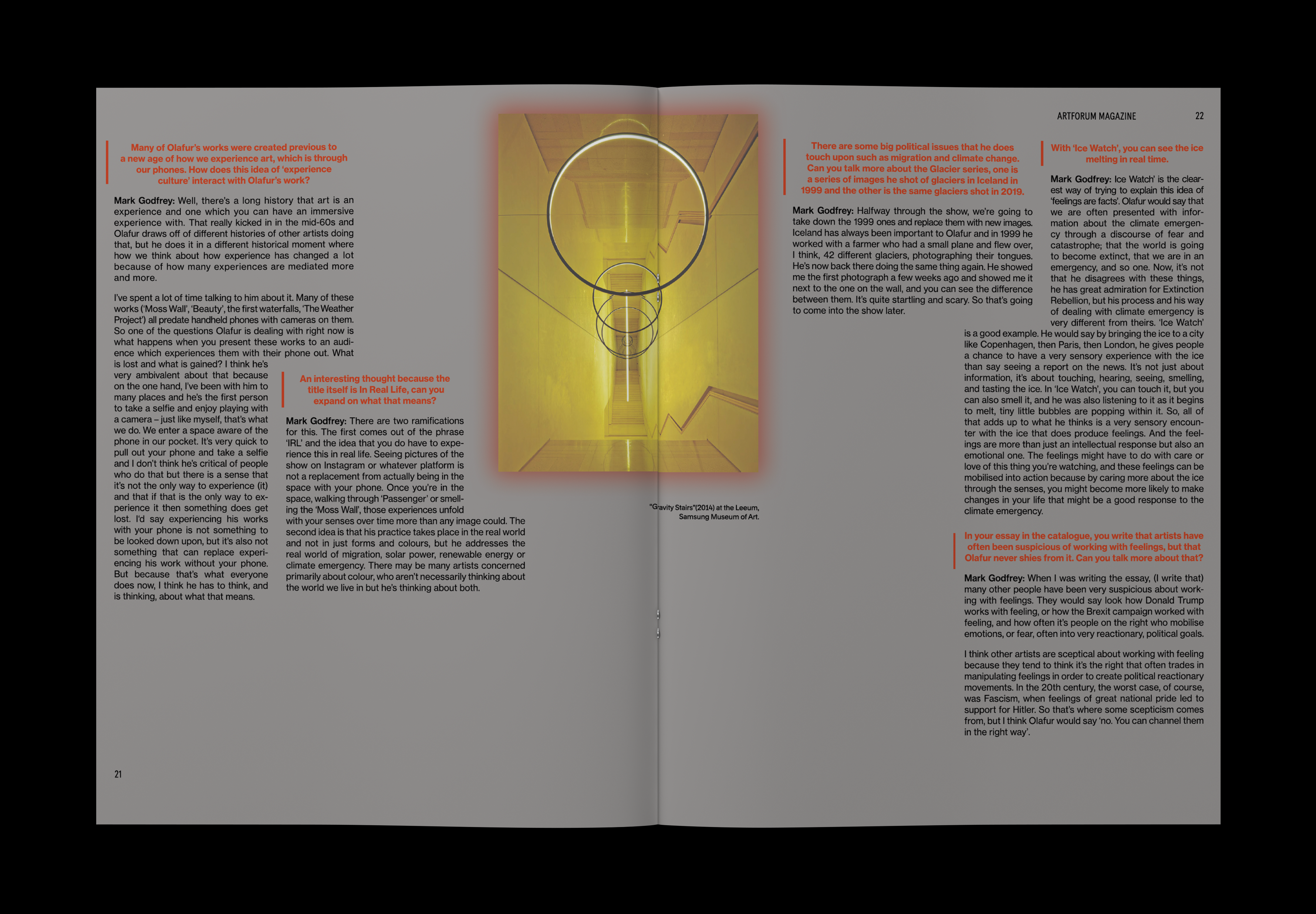
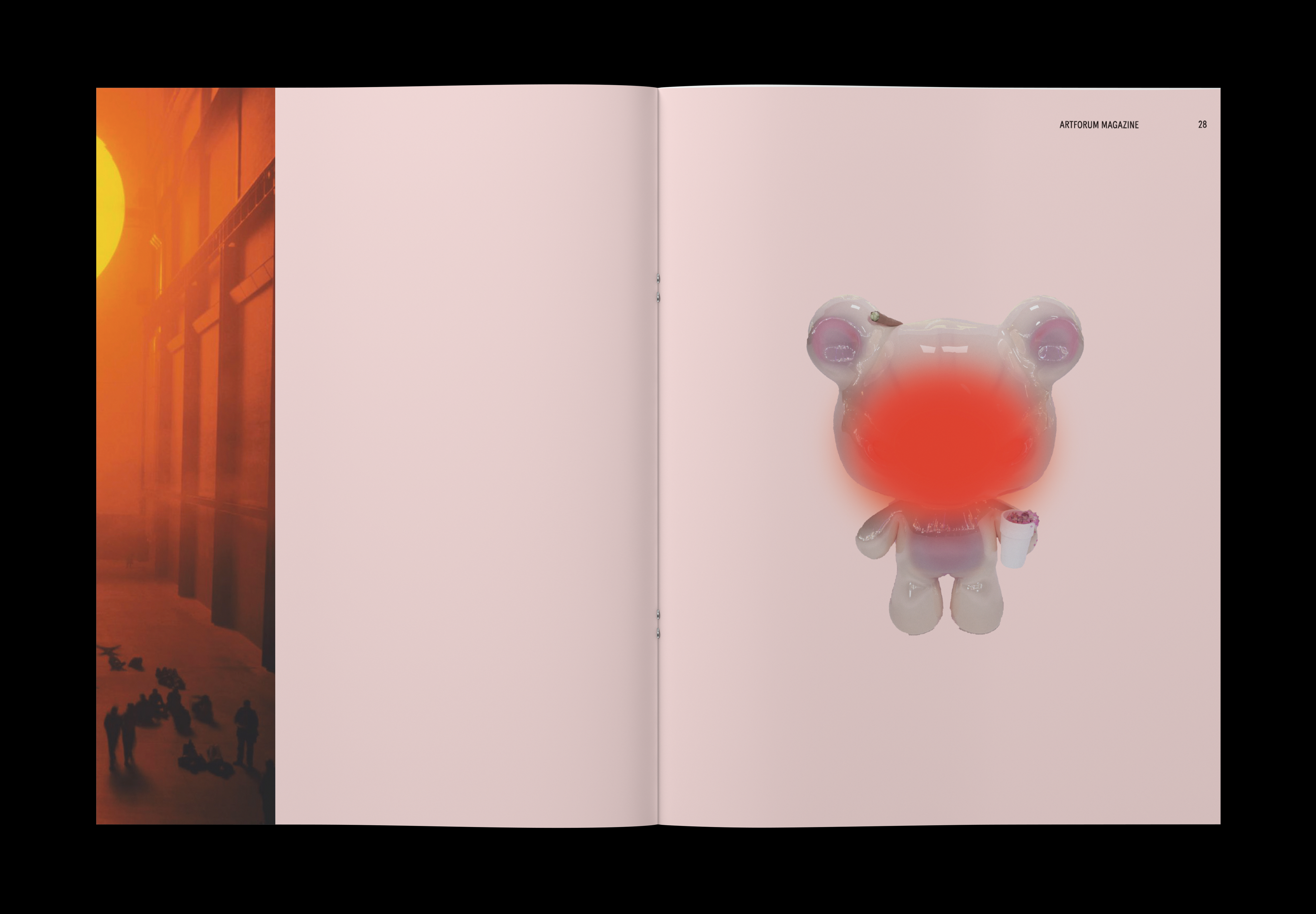
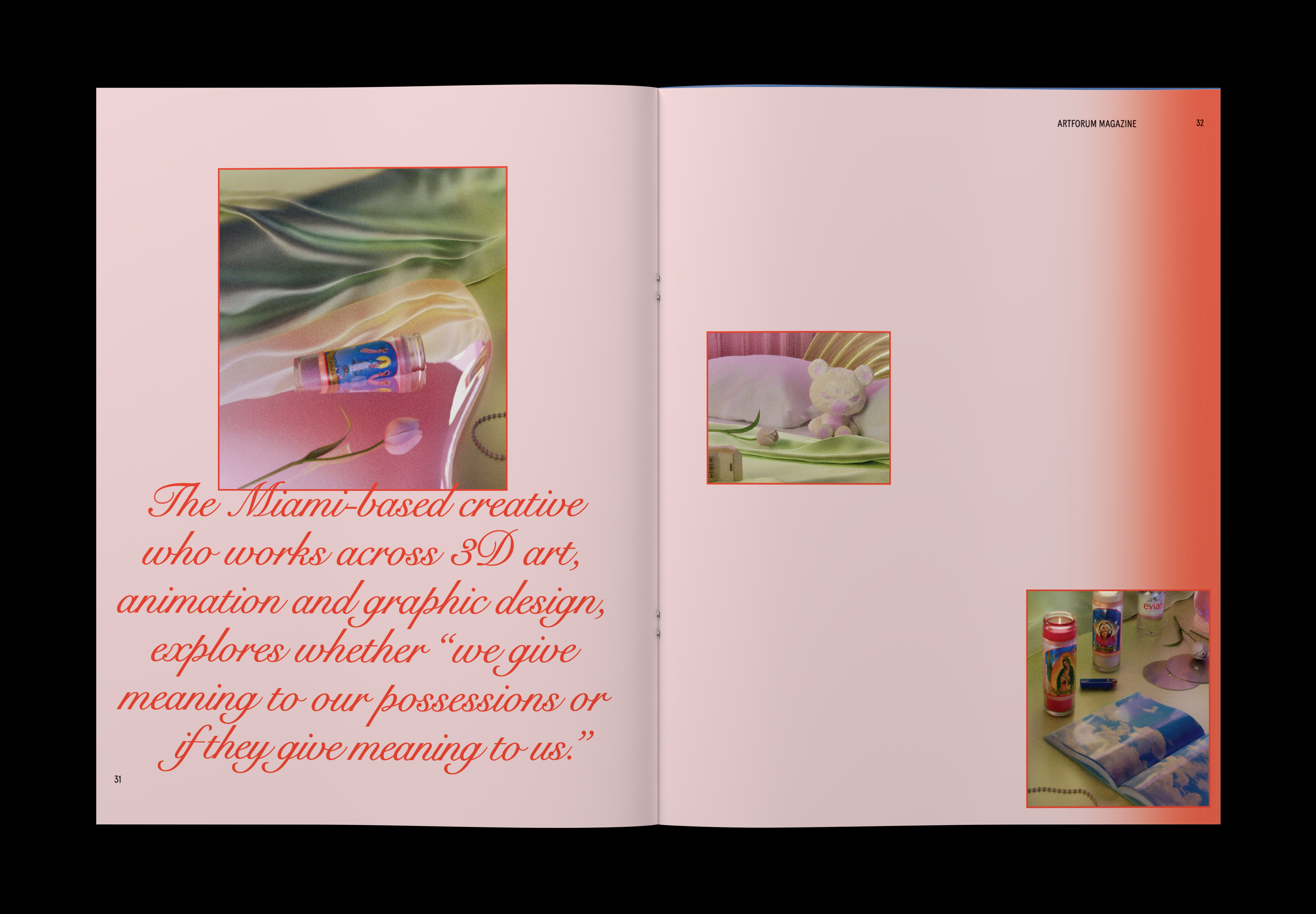
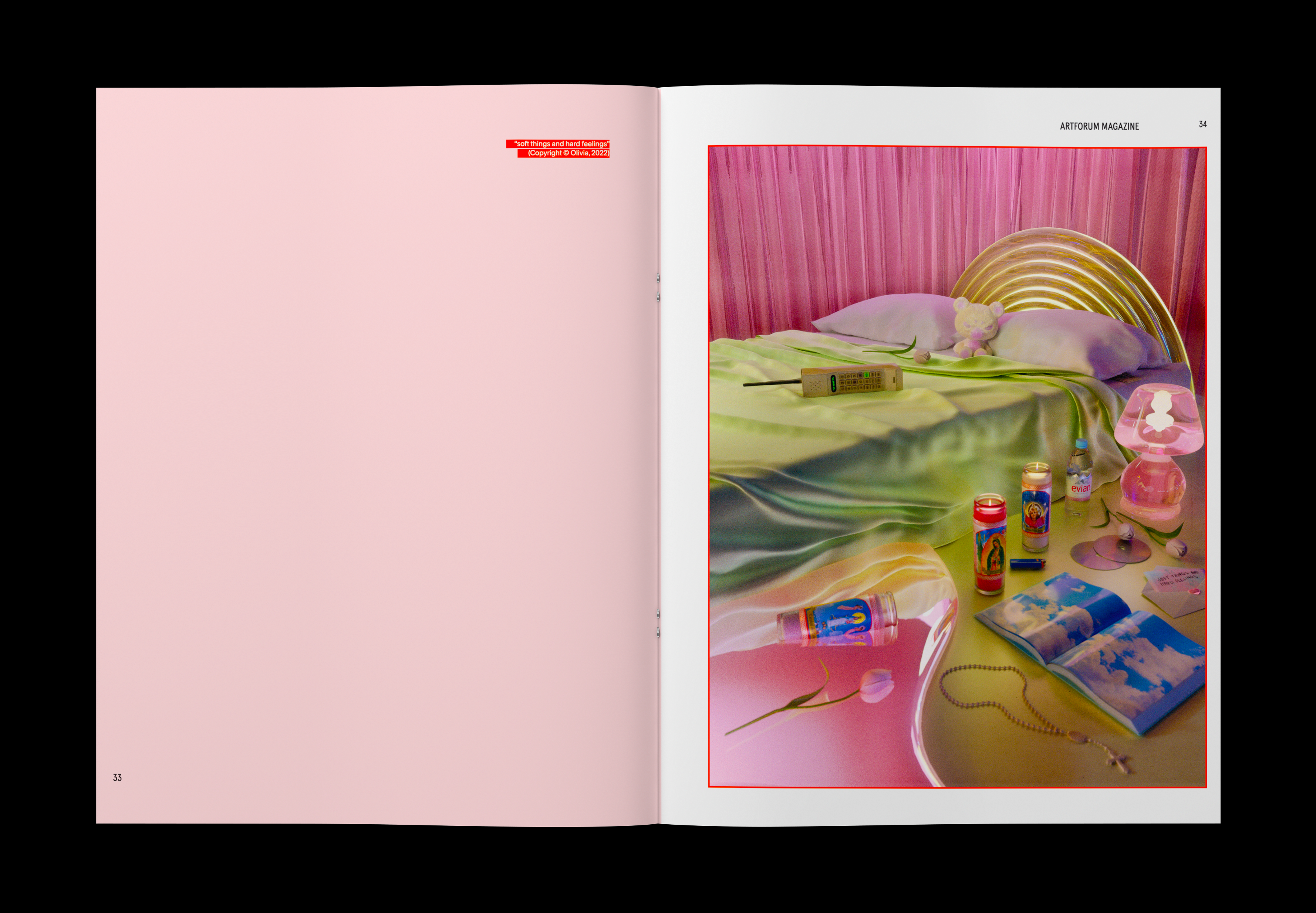
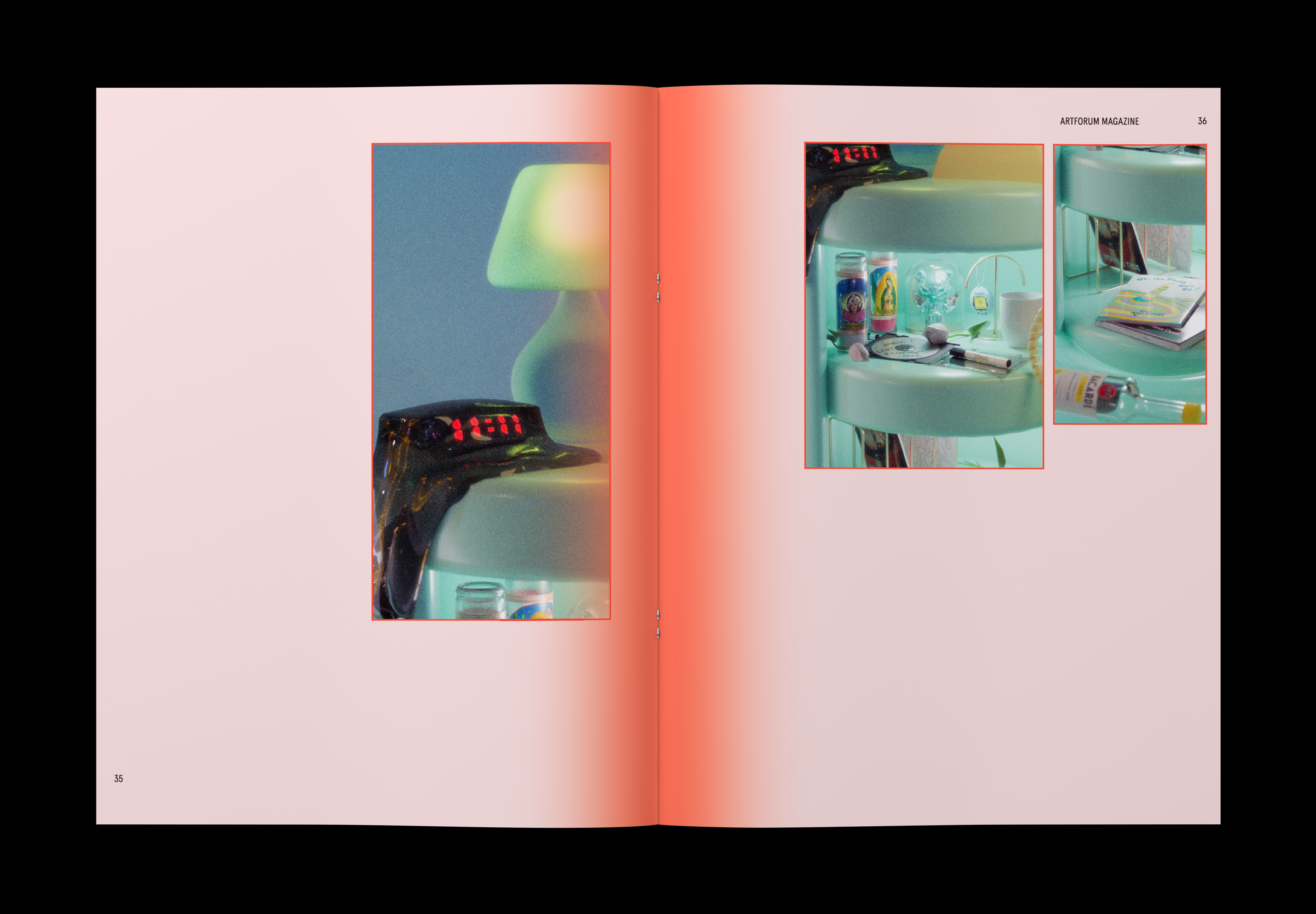
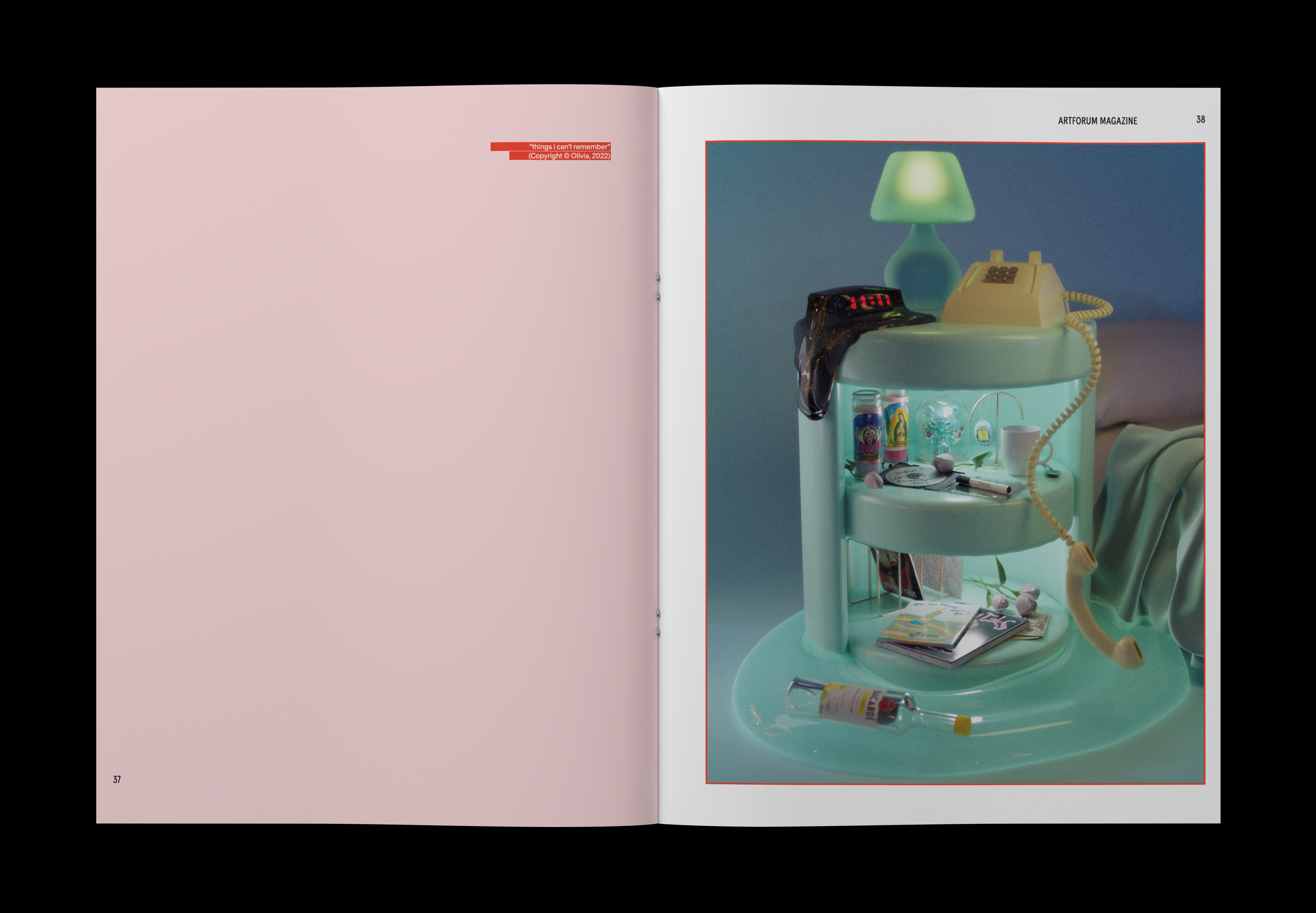
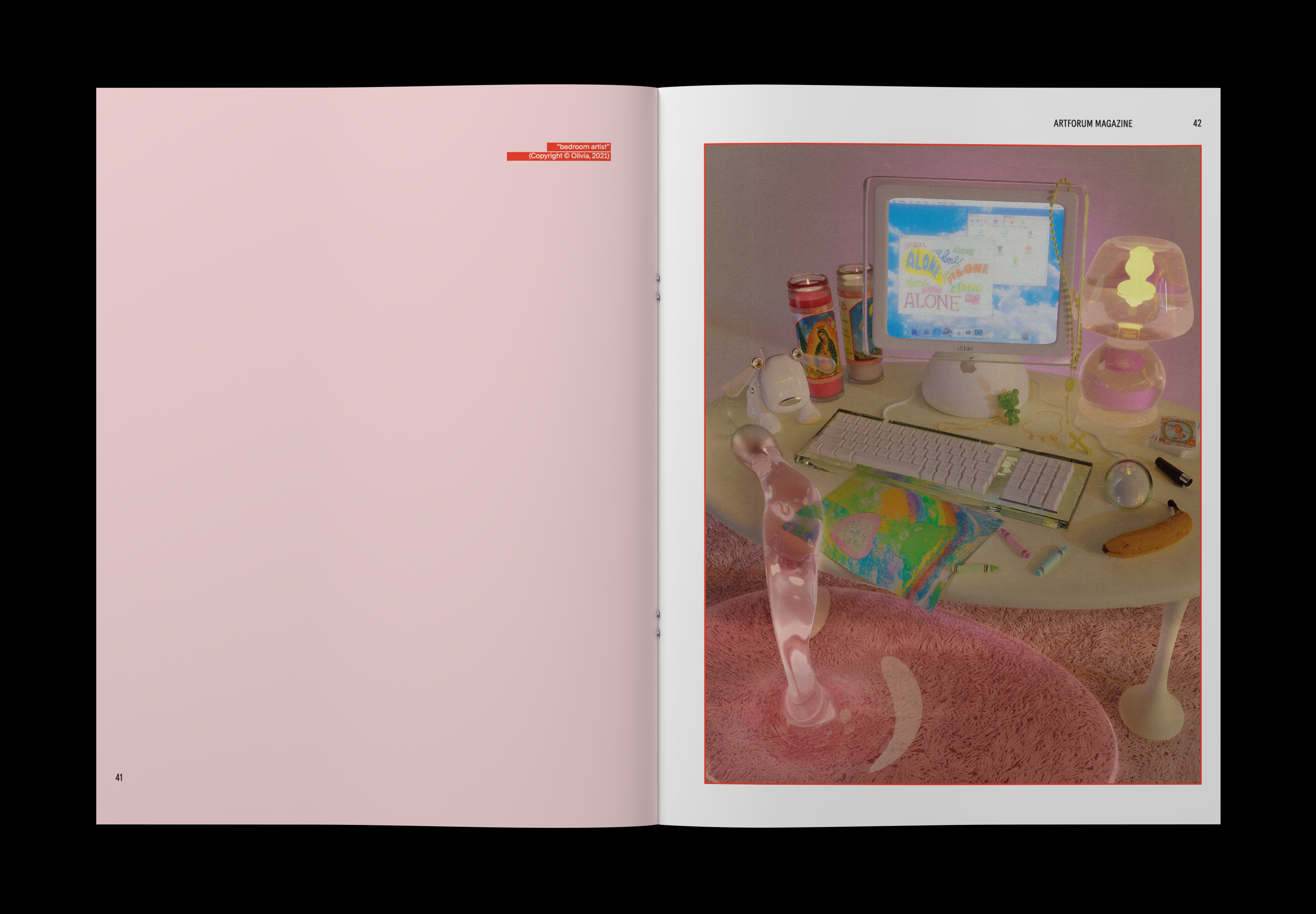
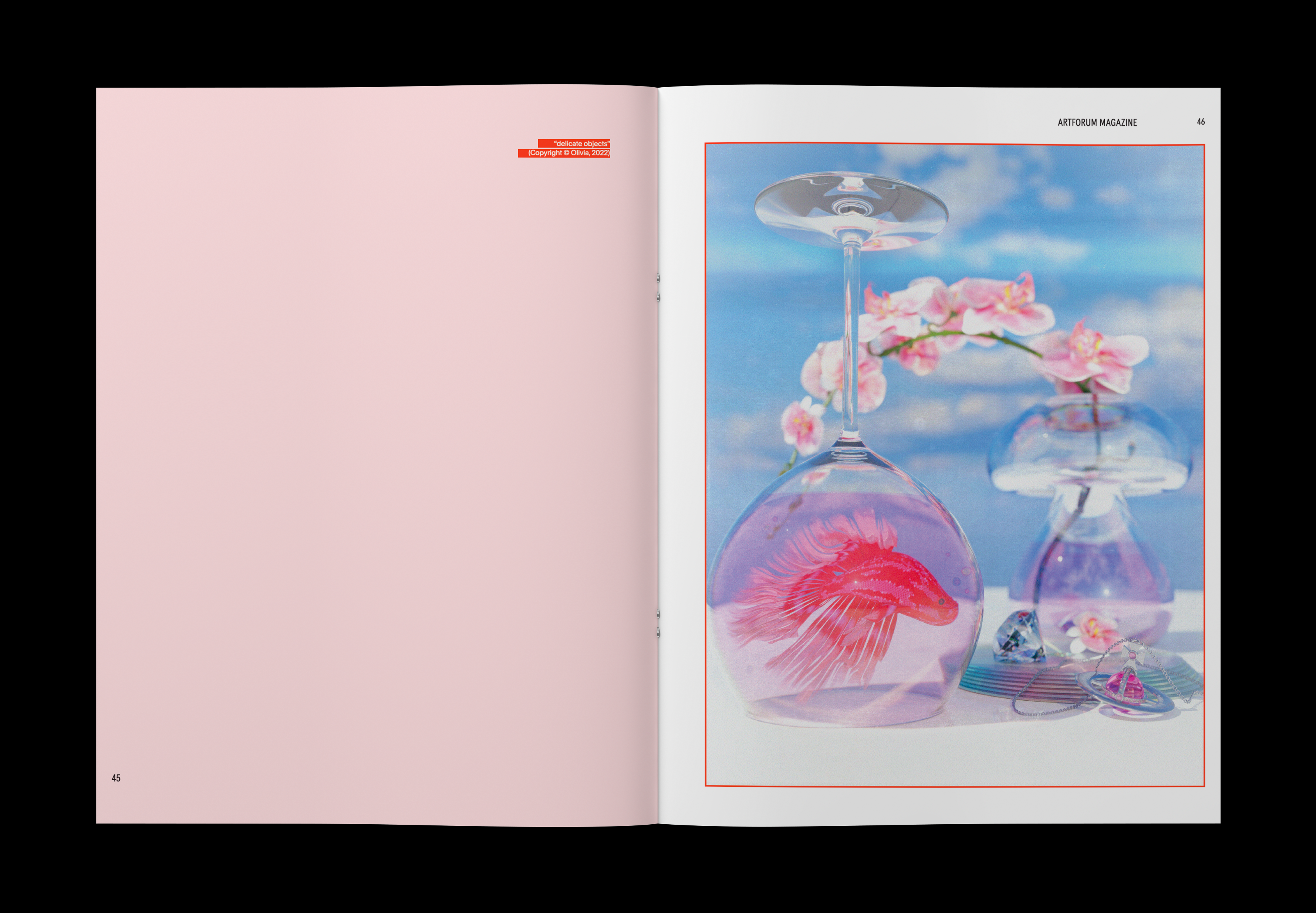
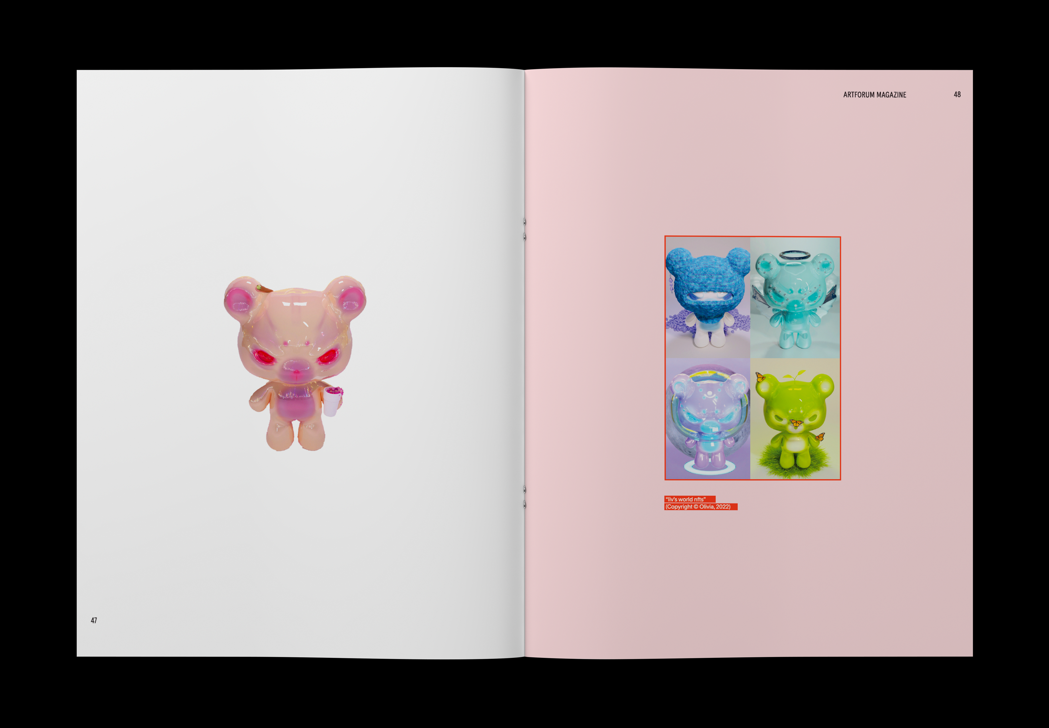
In the relaunch issue of Artforum magazine, the theme "Dreamscape" takes center stage, exploring surrealism, light, and senses through featured artists whose work embodies these concepts.


EDITORIAL DEVELOPMENT
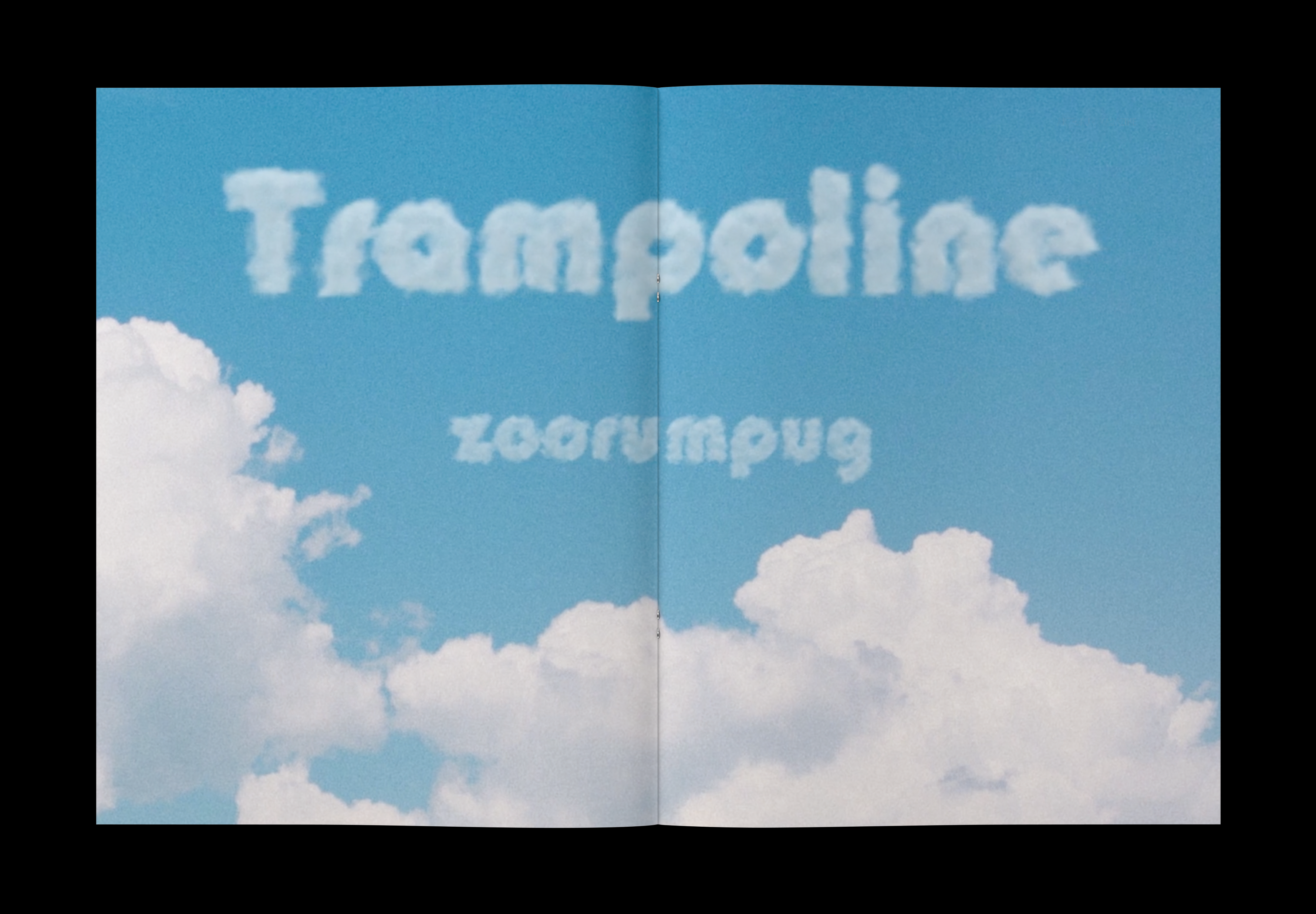
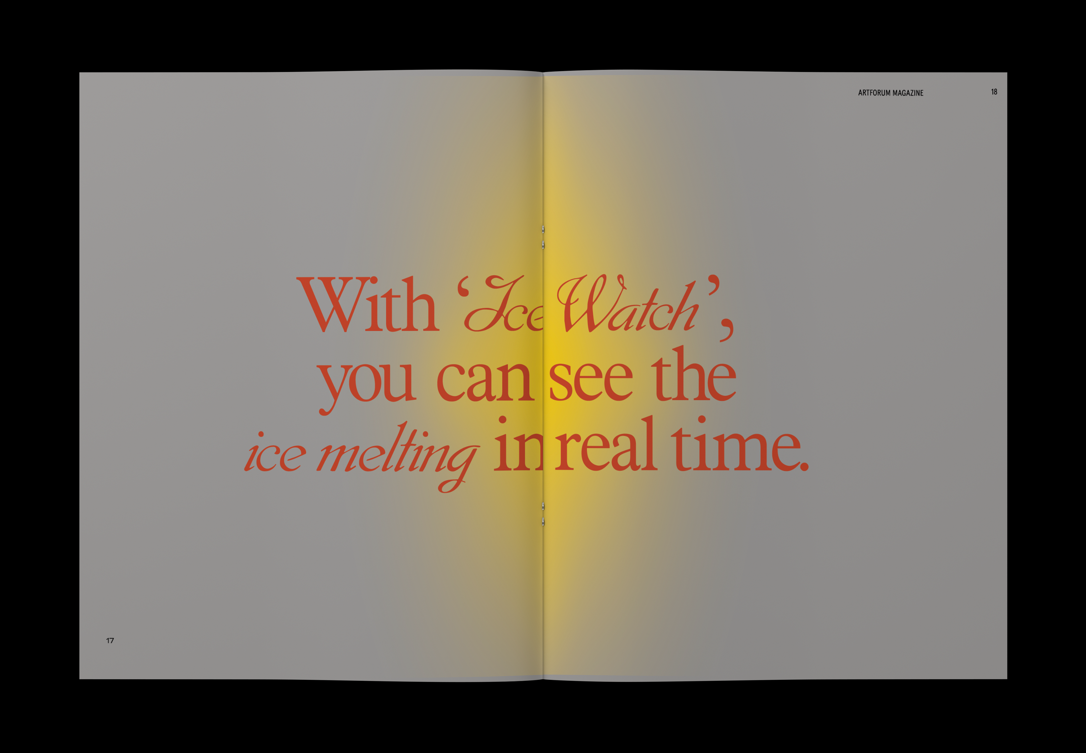
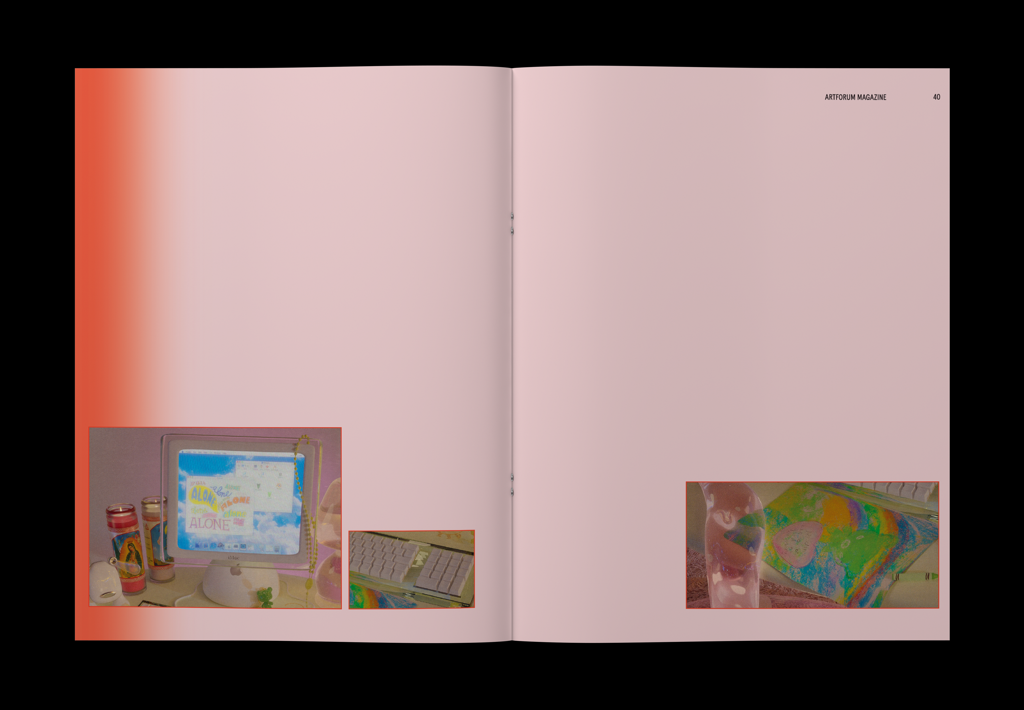
My aim was to immerse readers in a world filled with surreal, fantastical, and abstract elements, showcasing the exciting blend of reality and imagination in contemporary art. To enhance the dreamy experience, I utilized specific design methodologies, like initially blurring artwork images and revealing them gradually. Additionally, I seamlessly integrated moments from articles into transitions, creating a captivating and immersive journey. The ultimate goal was to evoke a sense of being lost in a mysterious and undefined dreamscape, providing readers with a unique and inspiring artistic exploration.
My aim was to immerse readers in a world filled with surreal, fantastical, and abstract elements, showcasing the exciting blend of reality and imagination in contemporary art. To enhance the dreamy experience, I utilized specific design methodologies, like initially blurring artwork images and revealing them gradually. Additionally, I seamlessly integrated moments from articles into transitions, creating a captivating and immersive journey. The ultimate goal was to evoke a sense of being lost in a mysterious and undefined dreamscape, providing readers with a unique and inspiring artistic exploration.


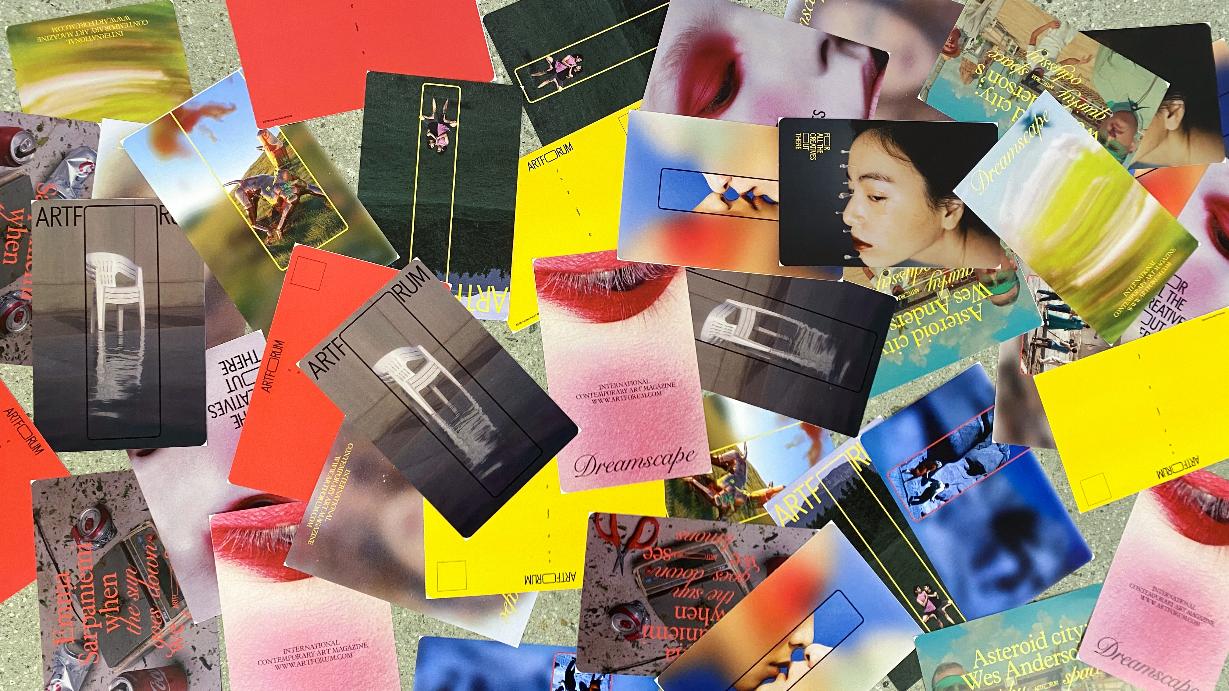
MACRO & MICRO POSTER
Three macro posters strategically use the letter 'O' from 'forum' as a symbol to emphasize the logo concept and enhance the tagline topic. Micro posters reference magazine spreads and techniques with consistent visuals.
Three macro posters strategically use the letter 'O' from 'forum' as a symbol to emphasize the logo concept and enhance the tagline topic. Micro posters reference magazine spreads and techniques with consistent visuals.